 When you make one mistake while designing and printing presentation folders, you’re likely actually making over 500 mistakes—because the error will show up on every folder you print.
To save yourself the cost of an entirely new print job, be sure to avoid these common design mistakes and printing pitfalls to produce the best folder designs possible.
Creating a Design
1. Using two PMS colors when one will do
If your PMS presentation folder design uses different tones of the same color, you’ll save money by using a single PMS color to achieve the effect.
For example, say you’re printing a monochromatic design consisting only of white, black, and shades of gray. The only color actually being used in this case is black; it’s just being used in different percentages to create different gray tones. Since PMS ink is translucent, it takes on the property of the white stock its printed on, so less ink means a lighter color and more ink means darker.

A design that uses different tones of the same color (including black) can usually be achieved by printing with just one PMS color.
2. Using 4-color process for branding

Photo Credit: Paweł Windys
4-color process can be used to print stunning color photography, but the colors aren’t as accurate as PMS ink. If you use CMYK to print branded elements, the color of the logo on your folder might be inconsistent with the color on your sign, website or other materials.
If full color folders are a must, remember that you can use CMYK for the majority of the design with only the branded elements printed in PMS. For more CMYK printing help, read our tips for designing and printing 4-color folders.
3. Not giving the logo enough space
When a logo is too close to other design elements, it doesn’t create the same amount of impact on the eye; the other elements become a distraction. Elements in close proximity can also sometimes bleed together during the printing process and become distorted or fuzzy.
Give your logo the attention it deserves by surrounding it with at least 1/4″ of whitespace. Most of all, make sure your logo stays at least 1/2″ away from the edge of your folder, or you run the risk of it getting cut off during printing. Read more about how to add your logo to a custom folder.

Remember to give ample whitespace between your logo and the other elements in your folder design (SKU: 08-57).
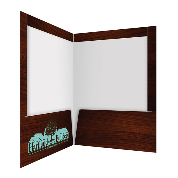
4. Neglecting to design the pocket
 The price of printing on your folder’s pockets is actually included with the cost of printing on the front and back cover. Many people neglect to realize this and leave the pocket blank, thinking it will save money on folder printing.
Since these areas are effectively free to print on, you can create more impressive folder designs for your clients at no extra cost. The pockets are a great place for branded design elements, contact information, full-color photos and other important content you may have been unable to include on the cover.
5. Problematic fonts
 If you use a font in your folder design without the proper reproduction rights, its owner could potentially issue a cease and desist or even take you to court. Fortunately, there are plenty of free fonts for print design are available, while others require you to pay a licensing fee. Remember that your printer may not have the same fonts that you do, so package up the necessary font files along with your design files when placing your order.
Not all fonts are created equally, and certain fonts won’t reproduce nicely with your imprint method of choice. Fancy, delicate fonts or serif fonts are often harder to use for embossing and foil stamping. You also have to make sure the letters aren’t too small or too close together, or you may end up with a bleeding effect between them. Be sure to check out our tips for printing fonts to avoid further typography-related mistakes.
6. Using images that aren’t print ready
 Sending your printer images that just aren’t ready to be printed can lead to unforeseen and costly mistakes. If your artwork is still in RGB mode when you’re printing in CMYK, for example, the printer will have to convert it themselves, leading to potential color discrepancies. Make sure you understand the difference between RGB vs. CMYK vs. PMS colors before handing over your artwork.
Another common mistake is sending low resolution images. The higher your image resolution, the better it will look when printed out. For more information on how to ensure that your images are print ready, refer to this guide to print ready graphics.
7. Not accounting for hand placement
Be careful not to place important design elements in areas where the audience is likely to cover them with their hands. For most presentation folders, this is the leftmost third of the front cover.

8. Leaving a white edge on a printed background
A printed background allows your folder design to utilize a lot of color without the need for colored stock—but the edges where the stock has been cut will still look white. This “thin white line” can be distracting if you have a design with mainly dark colors.
One way to circumvent this is to use colored stock, but this may not be an option if you’re printing with ink (as opposed to embossing or foil stamping). Consider using one-sided printing, so the second side will be blank white, making the edges blend in a bit better. You can also cover the edge of the folder entirely by printing on a folder with reinforced edges.
The printed side of this heavy duty folder is folded over the inside, further concealing the unprinted edge of the stock (SKU: 29-71-TOP).
If you want to do two-sided printing, you might make the opposite side light-colored or fade the design so that the ink doesn’t print all the way to the edge.
9. Omitting important contact information
You could have the most beautiful, expertly crafted folder imaginable… but if your recipient has no idea how to reach you, they can’t take much action. Including your phone number, e-mail, or website URL somewhere in your design is practically a no-brainer.
Location-wise, the inside pockets are a great choice, as this allows your front cover to be more expressive and attractive. You might be tempted to omit this information if you include business card slits (since the card will feature this information anyway), but in the case that your audience removes and loses your business card, you’ll want to cover all of your bases.

Selecting Products & Options
10. Selecting the standard design
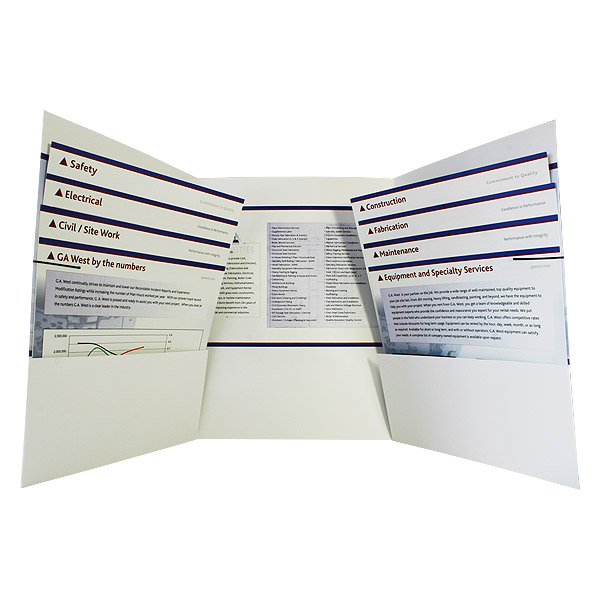
A rectangle is the first shape people envision when they think of a folder, so something in an unexpected shape (like an oblong, zigzag or wave pattern) shows that your design is unique and stands out amongst the crowd. It shows that you have creative ideas-too big to be constrained to just an ordinary rectangular folder.

Photo Credit: Jerry Lund
11. Passing up free slit options
 Why not take advantage of something offered to you for free? Pocket business card, brochure, and CD/DVD slits allow you to easily store media inside your folder, creating a complete print marketing package.
Remember that custom die-cutting can make a big impression; consider folders with business card slits or custom shaped slits for uniquely designed media. These allow you to tailor your folder to the size, shape and design of your other materials.
12. Choosing the wrong stock
Some design elements are completely incompatible with certain stocks, while others work particularly well together.
- If you’re printing with ink (either 4-color process or PMS spot printing), you’ll most likely want a light colored stock-preferably white. Ink is translucent and will take on the property of whatever it’s printed on, so printing on colored or dark stock can leave you with a muddled look.
- However, if you’re using foil stamping as your imprint method, it will actually look better on colored stock-especially when using metallic foil on dark stock.

- When it comes to blind embossing, any color will do, but a thicker, more fibrous stock will create the best imprint.
13. Forgetting feel and texture
A folder with an interesting texture engages your audience much more fully than one that simply looks pretty. You can add texture to a folder with:
- Coatings and finishes (such as suede or soft-touch)
- Textured stocks (including linen and felt)
- Special imprint methods (like foil folders and embossed folders)

Embossed imprints can give your folder an engaging textural effect. Photo Credit: The longevity of your folder is an important aspect for making it effective. After all, folder recipients are more likely to throw away your folder if it looks beat up and worn out. [caption id="attachment_3905" align="aligncenter" width="600"]
") Folders with rounded corners tend to look better for a longer period of time.
Folders with rounded corners tend to look better for a longer period of time.
Working with a Printer
15. Selecting the wrong printer
 Printing a high-quality presentation folder requires specialized machinery, multiple inspections and the right types of materials—something not every printer may have. Keep in mind that some printers offer custom folder printing but do not specialize in it, which means the product may not have gone through a comprehensive review for premium quality.
If you don’t choose the right printer with experience and an extensive review process, your end result could be a product with folds that don’t line up, inferior or visible glue, poorly constructed pockets or sloppy die cut lines.
16. Using the wrong template
Most printers use their own pocket folder templates, which are specialized for their own printing workflow. A template from another printer or one you downloaded from a third-party website won’t work properly. Remember to download the printer’s template straight from their website.

The Company Folders, Inc. template for a standard 2-pocket folder looks like this, but another company’s template might be structured entirely differently.
It’s also important to note that each product has its own template. Make sure not to use a tri-folder, vertical pocket folder or small card folder design template if that’s not the type of product you plan to create.
17. Not sending all the necessary files
The design you send to your printer might look fine on your own screen, but remember that they don’t have access to the files on your computer. If you forget to send them your linked artwork files, the version your printer looks at will have huge holes in it.
The vital files you should package with your print-ready design also include fonts, unless your font elements have been converted to a raster image. Even if this is the case, it’s a good idea to send them anyway, in case any last-minute changes have to be made.

Be sure to include any font files used in your design when you send the printer your artwork. Your font files on a Mac are usually located in Library/Fonts. On a PC, look in Windows/Fonts.
Your printer also may not have the same plug-ins and special elements that you use in your design software, so be sure to send anything the printer might need to view your file in its correct, print-ready state.
18. Not fully reviewing your proof
 Before your printer commits to the full print job, they will send you a proof copy of what the final printed design will look like. Many designers assume this will be the same version that they sent to the printer, but there may be discrepancies that you were unaware of, and these can turn up in your final product if you’re not careful.
Be sure to go over the proof copy in thorough detail, comparing it to your own files and to the files you’ve sent to your clients. If there is something that seems off, make sure you tell your printer about it, even if it’s small. Something that seems ignorable on your proof copy may stick out like a sore thumb in the final printed version.
Conclusion
All of these errors are completely avoidable, especially if you follow our tips for working with your printer. A good printer will prevent you from moving forward on a design that isn’t ready to be printed, and will walk you through the process to help you avoid making any common design mistakes. Talk to them about which options are available and which will present your brand in the best possible light.
You can also download our folder design cheat sheet for more tips and tricks for optimizing your folder.
Have you run into other pesky folder printing or design mistakes? Please leave your examples, questions, and comments below!
This post is a part of our Presentation Folders 101 product guide.


I hope you have shared all types of problem that faces a customer. It’ an amazing idea to create the best and long-lasting eye-catching from designing to finished products.
Thanking you