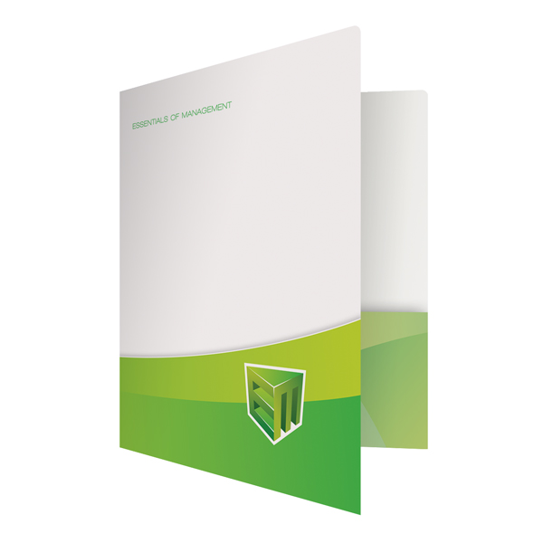
You don’t have to be a skilled artist to design a presentation folder, but you do need to know how to make an impact visually. You may have been taught to never judge a book by its cover, but that doesn’t mean your clients will follow the same advice. If the presentation folder design is off-putting to your clients, then the information inside the folder will not be taken seriously. However, improving the design of your presentation folder is easy when you know what mistakes to avoid.

Too many clashing visual elements can ruin your folder design.
Simplify
A well-designed folder does not need to be complicated. A single bold picture or logo can have a greater effect than a folder covered in a collage of images. Cluttering up your pocket folder design with too many visual components will make it difficult for your company theme to come across. If you do use multiple images, have one picture be the primary focus with the other pictures there to complement or draw the eye to the primary image.
Color Coordinate
Color is an important aspect for presentation folders and you have to know when to use it properly. A hot pink folder would look out of place at a funeral home, but would be the perfect color for a nail salon. Choose a color scheme that fits your company’s image while still complimenting the design of your folder.
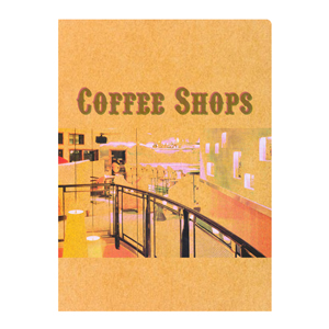
Using the wrong type of stock can ruin the visual effect of your design.
Choose the Right Stock
There’s nothing worse than ruining an attractive presentation folder design by printing it on the wrong type of stock. Dark colored paper and linen stock are attractive options, but they will not show the ink as well as light-colored or gloss paper. Likewise, textured paper can also muddle the details of your design. Ask for stock samples and pick one that best suits your needs.
Be Concise
When you design presentation folders for promotional use, you want some of your company’s information to be incorporated into the folder itself. However, the information should be brief and to the point. Cluttering your folder with too much text will have a negative impact on your design. Think of your folder as a newspaper–the cover is the headline, while the information inside is the article. Save the details for where they matter most.

If your folder has a window, you need to be aware of what will go behind it.
Use Special Features Effectively
When it comes time to order folders you may find a number of optional special features in the folder printing guidelines. These specialty folders can make a great impact when properly utilized or completely ruin the design of the presentation folder when not. For example, a window on the front of the folder gives you a look at the contents inside-but this design only works if there is something visually appealing behind the window. If all you see are the papers contained in the folder, it’s not being properly utilized.
Request a Sample
Most companies will let you try it before you buy it. Ask for a sample of your presentation folder design before committing to an order so that you can catch any design flaws before it’s too late to do anything about them.
When in doubt, it’s always a good idea to ask for a second opinion. Getting feedback on your design will help you to avoid making any glaring mistakes and will give you a better understanding of what works and what doesn’t.
This post is a part of our Presentation Folders 101 product guide.

