Of the 27,397,260 business cards printed every day, 88% will be thrown out in less than a week. But that doesn’t happen because business cards are ineffective as a marketing medium. In fact, it only takes 2,000 business cards to increase a company’s sales by nearly 3%. That’s a shockingly high return for just one marketing resource. So why do so many cards end up in the garbage?
The fact is, a lot of business cards have crummy designs. No one wants to hold on to something that looks and feels cheap—at least, not for very long. And that means the person whose name is on that card isn’t getting their money’s worth.
But as a designer, you have the power to create an exceptionally unique business card that recipients will hold onto for months (or even years!) Of course, most cards look so much alike, it’s easy to get stuck in a creative rut. You’ll need to break out of the box, which is why we’ve made this step-by-step guide to help you design the perfect business card.
Download this super helpful graphic so you can keep this quick and easy reference nearby while you work. You can also work with a professional graphic designer to create the ultimate business card when you use our business card design services.
Plan ahead
It’s best to start with a little research so you know what to put on the business card. Talk to your client about their goals and fill out a creative brief. Then, collect templates or real business cards to use for inspiration—you’ll find plenty of online design galleries, like Behance—and examine each one. Which concepts might help you meet your design goals? Which ones won’t?
Before you adopt an idea that you like, think about the rules of design that made it work. A black background looks sophisticated for a lawyer, but for a baker, black is more likely to remind patrons of overcooked pastries. Any idea that won’t meet your client’s needs isn’t worth putting on their business card.
Choose contact information
Once you have a basic concept, set it aside. You need to finalize the card’s message first—starting with contact info. Choosing the right information can be a real challenge because people connect in so many ways. The secret is to learn how your target audience likes to communicate and connect on their level.
Name and title
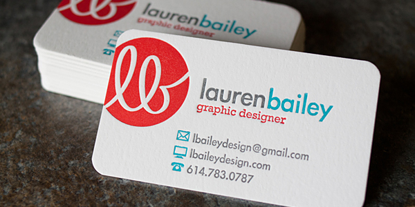
Image Credit: Lauren Bailey Design
It’s sad to think that some people actually use business cards with no name anywhere. No-name cards are pretty much useless because prospects want to connect with an actual person, not some anonymous “contact.” A name and job title let people know who your client is and what they do.
You can even spice titles up to make them more unique, so long as you avoid industry jargon and clichés—while you’re at it, go ahead and remove “ninja,” “guru,” and “rock star” from your vocabulary. Something simple like “Lawn Artist” in place of “Landscaper” can do the trick.
Company name and logo
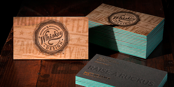
Image Credit: Whiskey Design
Prospects need to trust not only the cardholder, but the brand the cardholder represents. That’s simple enough if your client is self-employed. When your client works for a company, you can help establish brand trust by emphasizing the business’s name and logo.
Phone
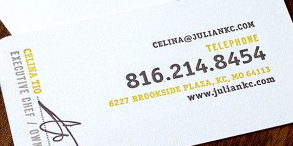
Image Credit: Nathaniel Cooper and Jordan Gray
Phone numbers are extremely important. Believe it or not, some people still prefer talking on the phone because it’s more personal than a website and less likely to be misinterpreted than an email.
If you’re dealing with multiple numbers, be sure to label which number is which. You’ll also probably want to avoid including any personal, non-business numbers (unless the client’s friends and family are the target audience).
Email and URL
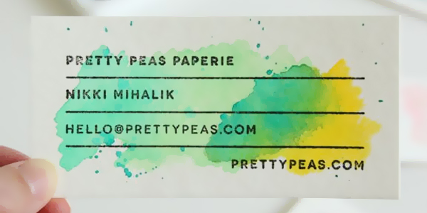
Image Credit: Akula Kreative
Most people pair email and web addresses together. That way, prospects can either contact your client directly or explore their website on their own.
As with phone numbers, only use your client’s professional email address, not a personal address that they only use with friends and family, so the card doesn’t come across as too casual.
You may want to link to a blog, video, or about page that “introduces” prospects to your client. Just make sure the URL isn’t too complicated. You can use a custom URL shortener like Bitly to make the address easy to read and remember.
Social media
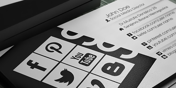
Image Credit: Riverpixels Studio
It’s a good rule of thumb to only promote the social media presence that’s most relevant to your client’s brand. Choosing which social profile to include is a complicated process, so be sure to consider the nature of your client’s business. If they’re a no-nonsense stockbroker, Instagram probably isn’t the best choice.
You’ll also want to avoid these common mistakes when including social media in print designs.
QR code
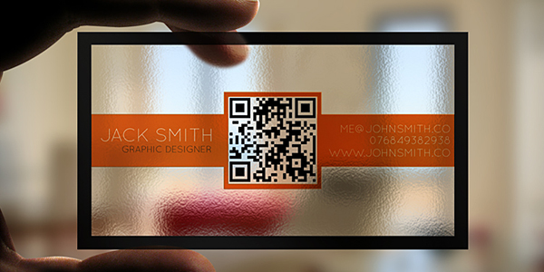
Image Credit: Atzar
QR codes occupy a lot of space, but they’re still the most efficient way to link printed and online materials together. They’re visually cleaner than URLs, making them the perfect combination of professional and casual. You can link them to a client’s website, or you can use them in other creative ways. For example, audible nametags (ANTs) let prospects scan the QR code and learn how to pronounce your client’s name.
Address
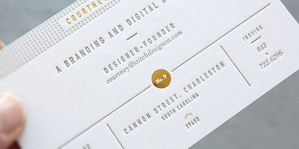
Image Credit: Stitch Design Co.
Would you wear a parka in the Bahamas? Of course not. It’s unnecessary and bulky—just like a physical address on a card for someone who only works online. When your client has a strong web presence, you can skip the address to save space. Only include it when your client relies on in-store visitors.
Map
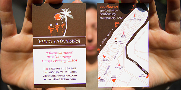
Image Credit: ModLao
Suppose your client does need an address after all. Instead of worrying about how much space it’s occupying, why not go all out and put a map on the back of the card? This is simple enough to do with Google Maps, so long as you include a copyright attribution. You can also create a map from scratch in Illustrator, which is useful for controlling the amount of detail it includes.
Add supportive text
Contact info is the main part of a business card’s message, but a card that only informs people how to contact you isn’t very compelling. Your next step is telling the audience why they should contact your client. That usually means a tagline or a call to action.
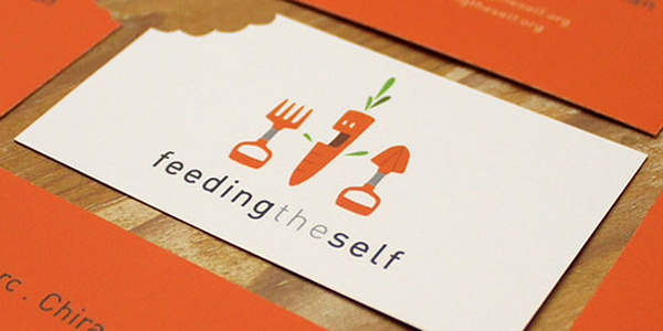
Image Credit: Lumo Design Co.
Taglines are an easy way to instantly inform people about who your client is and what they do, like a clarifier. For instance, the owners of a bakery with a generic name like Sarah’s might use a tagline like “The Friendliest Bakery in Town” to set themselves apart.
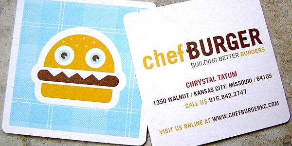
Image Credit: Design Ranch
A call to action, on the other hand, is a command. It gives prospects a clear next step, like “Call and get a free quote!” or “Visit our website!” Your call to action might even be in the form of a promotional offer, allowing customers to take the card to your client’s store and redeem it for discounts or free samples (with your client’s permission, of course). Only include one call to action, though; consumers respond best when they’re given just one thing to do.
Add photos or illustrations
Adding photos to a business card lets you express certain things that words can’t. For instance, you might use a photographic background to showcase examples of your client’s work or a portrait to remind prospects who the cardholder is.
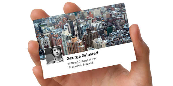
Image Credit: Moo.com
Portraits are especially effective because they let people match your client’s name to the person they met earlier, making it an easy way to refresh their memory when they come across the card later. Just make sure the photo is appropriate. Quirky is cute; duck-faced selfies aren’t.
If your client doesn’t like the idea of putting their own photo on a business card, you can still create a unique visual effect with an illustration. Maybe that’s a cartoon caricature of your client (ask first) or a realistic sketch of their product. The sky’s the limit, and a good illustration is guaranteed to stand out.
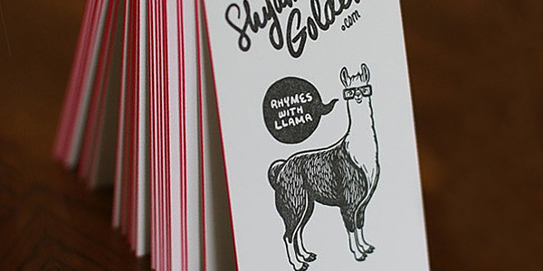
Image Credit: Shyama Golden
Choose a material
You’ve heard the saying, “The medium is the message.” How you present your client’s information is every bit as important as the information itself. To stand out, you may want to opt for something more unconventional than cheap, flimsy paper. Just make sure the material you select is actually related to your client’s company before you start designing beef jerky business cards (yes, that’s a thing).
High-quality paper
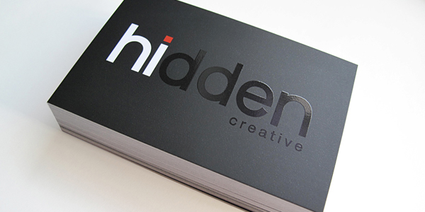
Image Credit: Hidden Creative
One potential drawback with unconventional materials is that you lose a lot of practicality and professionalism, while classic paper is more comforting and expected. If your client wants to stick with a traditional paper card, suggest that they invest in sturdy paper—between 14-point and 24-point—so their card won’t look cheap or tear easily.
Recycled paper
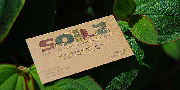
Image Credit: Greenprinter
Recycled paper is a great way to reinforce an eco-friendly client’s message. But even if they’re not “green,” this option is still worth mentioning. People throw out more than 9 billion business cards every year, and printing on recycled paper helps reduce this waste. It won’t just help your client’s image; it’ll help the planet.
Textured materials
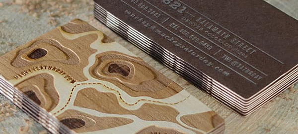
Image Credit: Mackey Saturday
Paper can be textured through embossing or a unique stock, but imagine how surprised someone would be to receive a business card made out of quilted leather, wood, or even sandpaper. It sounds weird, but texture creates a whole new experience. Engaging more than one sense makes the card—and its owner—easier to remember.
Metal
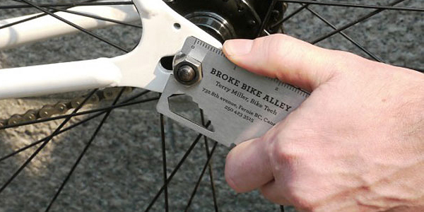
Image Credit: Rethink Canada
Metal is durable and attention-grabbing, but it’s also expensive. You can offset the cost by designing a card people can use for years. A miniature tool, kitchen utensil, or magnet are all practical items that are easy to emblazon with your client’s contact info—and dual-purpose cards are much more likely to survive than paper ones.
Food
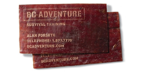
Image Credit: Meat Cards
Why not thrive on the idea that the card is destined to disappear? Let the customer eat it instead of simply throwing it away. Edible cards may not have a long lifespan, but they’re certainly hard to forget.
Treats like chocolate and beef jerky seem to work especially well; they’ll keep for a while and are popular snacks. For foods that aren’t print-friendly, you may want to attach a business card to a sample package instead. Or, print the business card on a candy wrapper and seal a tasty treat inside.
Shape your business card
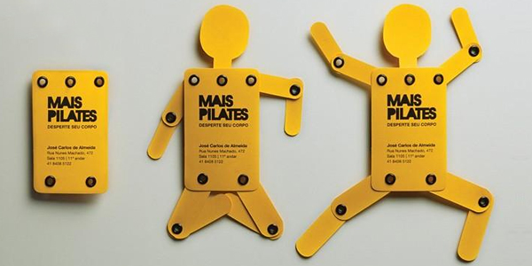
Image Credit: Market Data Direct & Digital
No matter where you go in the world, business cards are almost always rectangular. The standard size in the U.S. is a 3.5×2 inch horizontal rectangle. But why stay stuck in a rut? Ditch old standards for something fresh and creative.
A die-cut card can take any shape your client wants—whether that’s a circle, a giraffe, a car’s head gasket, or something else entirely. Die-cutting also lets you put holes in the middle of a card to create an interactive or stencil design.
3D designs go a step further. At this point, you’re not really designing a card anymore—you’re creating a small object (say, a miniature wrench or a tiny toilet plunger) with your client’s contact info on it. And that’s awesome, because it will stand out no matter where your client goes, with very little chance it will end up in the trash.
Of course, shaped business cards come with their own set of problems. Bulky or unusual shapes are inconvenient—it’s not like they’ll fit in a pocket or wallet. Think about whether the benefits are worth the risk before you start creating random shapes.
Here’s a tip: to add a little shape without being too wacky, round the card’s corners. On top of giving the card an interesting look, this will help to prevent dog-earing and natural wear-and-tear.
Choose an imprint method
To a large extent, the type of material you choose will dictate your imprint options; you wouldn’t want to print non-edible ink on a piece of beef jerky, obviously. Unusual mediums like meat and metal can typically only be imprinted in a single way, but printing on paper opens you up to several different options, ranging from colorful ink to shiny, metallic foil.
PMS printing
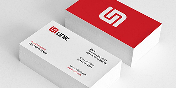
Image Credit: Emanuele Cecini
PMS stands for the Pantone Matching System, which is based on over a thousand standardized ink colors. PMS inks are pre-mixed to match those color values, making this an excellent choice when you need to match an existing logo or color scheme as closely as possible. PMS also gives you the option of using colors that CMYK can’t handle as well (like orange and navy blue), along with specialty inks (like neon and metallic).
Four-color (CMYK) printing
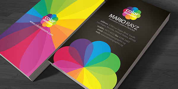
Image Credit: Mario Rayz
Four-color process is also known as CMYK because each ink color is formed from a combination of cyan, magenta, yellow, and black (also known as “key”). That gives you access to a full spectrum of color instead of just specific hues. If you want your business card to incorporate full-color photography or a design that contains four or more colors, this is your best option.
Foil stamping
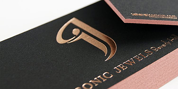
Image Credit: Primo Press
With this method, your card is stamped with sleek, smooth foil in your choice of color. Both metallic and non-metallic foils are available, so you don’t necessarily need to use shiny gold or silver; you might go with a smooth matte red, instead.
Embossing/Debossing
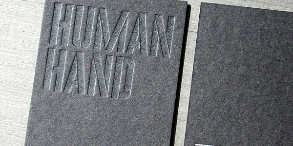
Image Credit: Studio On Fire
Your design is physically raised (embossed) or recessed (debossed) into the business card’s stock. This technique is often used in combination with other methods; for example, an embossed foil effect suggests elegance and class. Be careful when embossing text; if the words are too small or if you don’t use ink or foil to accentuate them, they won’t be readable.
Choose a coating
A coating is a film or sealant that enhances your card’s durability and appearance. Coatings are often called “finishes” because they’re applied after the project is printed. But since they can have a huge effect on the look and feel of the final design, it’s never a bad idea to plan ahead.
If you’re using an imprint method with an element of texture (such as embossing or foil stamping), you’ll probably want to avoid using any coatings so you won’t diminish that effect.
Aqueous
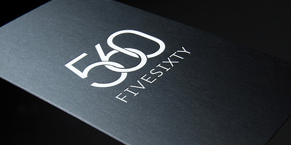
Image Credit: Sync Media
Aqueous coatings are water-based and eco-friendly, offering basic protection against scuffs and fingerprints. Depending on what printer you work with, you might have several types of aqueous coatings to choose from. Different coatings provide different levels of shininess, ranging from high reflectivity (gloss) to no shine at all (matte).
Lamination
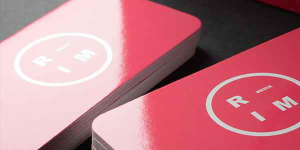
Image Credit: Japan Print
This option is usually a bit more expensive, but it grants your card heavy-duty protection against spills, rips, and other damage. Laminated cards last longer, so your client should be able to get more use out of them.
UV
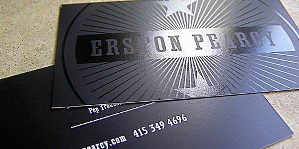
Image Credit: Halo Design Studios
Ultraviolet (UV) coating won’t do much to improve your business card’s durability, but it will add a great deal of reflectivity—even more than aqueous gloss. UV coating also helps bring out the colors in a design; bright business cards will really pop with this technique.
Spot
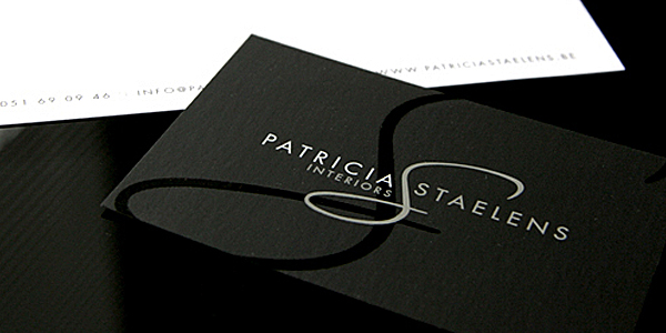
Image Credit: Chilli Design
You don’t necessarily need to coat the entire card, or even use just one type of coating. Spot coatings let you apply a finish to a specific area of the business card. This is especially popular with UV coating, which you can use to draw attention to the text or logo on a card by making it extra shiny.
Choose a color scheme
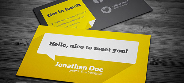
Image Credit: Business Card Journal
Color is extremely important to your design, especially considering that people keep colorful business cards ten times longer than standard black-and-white ones. The best colors for business cards are black backgrounds or pops of red because they stand out the most. That said, the colors that grab the most attention won’t always match your client’s needs.
If your client already has a corporate color scheme that they use for their other branded materials, more power to you. If not, you’ll need to design a whole new palette to suit your client. Stop at two or three colors, though—anything more is too distracting.
Make sure the colors you choose match the goals you discussed with your client at the beginning of the project. Don’t just pick colors that you think look nice. This business card is an extension of your client’s personality—not yours.
Select typography
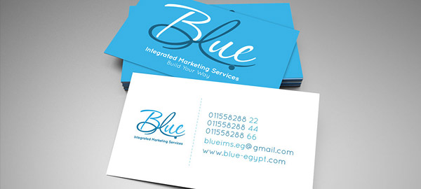
Image Credit: I. Farid
Finding the right combination of typefaces can be a challenge. It’s usually best to limit yourself to two or three fonts—like colors, too many fonts can be distracting. Consider pairing a neat, easy-to-read serif or sans serif with a decorative font. That way, you’re adding personality to your client’s name, but the contact info stays readable.
You can also create hierarchy with type size, with the most important elements—like your client’s name and website—being larger. Your ideal font size will depend on the card’s layout and the amount of text you include, but always use at least an 8-point font so people can read the card easily. Here are the best fonts for print design.
Lay it out
Now you have all of the elements you need for your business card design. So how on earth do you put them together? You want a layout that’s easy to read, but you also have to make a lot of information fit a small space.
Start by creating hierarchy with size. The more important an item, the bigger it should be. Items of equal importance should be similar sizes and placed physically near each other. Make your focal point—usually the name or logo—the largest element, occupying at least ¼ of the design.

Image Credit: Japan Print
As you establish hierarchy, you’ll start to see whether or not your design is too cluttered. White space is a good measuring tool for this; each element should have an area that is all its own. If your design doesn’t have any white space, you probably need to cull something out—or at the very least, use the back of the card.
Some people say the back of the card should stay blank so prospects can write notes on it. But no one is going to write on the back of the card if the front is too crowded to read. Moving contact info to the back is especially wise if you have a cool photo, illustration, or logo you want to showcase on the front.
Let’s say you’ve tried creating hierarchy, using white space, and moving info to the back, and your design is still squished together like sardines in a can. You may need a fresh perspective, such as a vertical layout instead of horizontal. The new point of view may spark your creativity.
Or, do a radical overhaul. Pick the five most vital items. Then, cut everything else. Yep, everything. You’ll be amazed how much neater the design will look. (Your client may need some time to accept this idea, but most will like the new, cleaner design.)
Prep for printing
Contrary to popular belief, a successful print run isn’t just the printer’s responsibility. As a designer, you have the power to make the process much smoother. Communicate with the printer and prepare the business card artwork for optimal printing—especially when designing for yourself or for inexperienced clients.
Bleeds, borders and safe areas
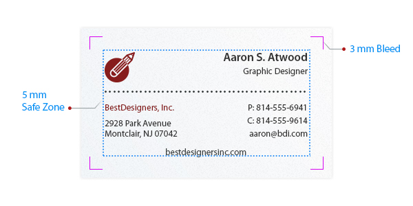
Small inconsistencies can occur when products are die cut after they’ve been printed. It’s not noticeable in most cases, but it sticks out like a sore thumb on a small product, where one wrong cut can ruin a whole design. Protect your design by including at least a 3mm bleed area. To be doubly safe, make sure all elements are inside a “safe area”—usually 5mm from the edge of the card—and avoid the use of borders, which are likely to be lopped off unevenly.
Color, resolution and extension
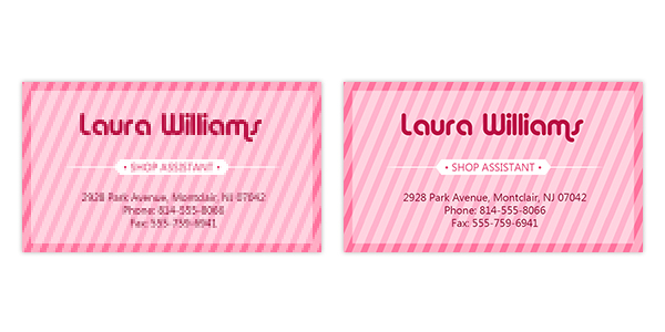
For the best print results, create optimal design conditions. Check that you’re using CMYK or PMS colors—not RGB. Then, make sure your resolution is set to a minimum of 300ppi. (Any lower, and you’ll end up with a fuzzy business card.)
Last but not least, save your design. We suggest saving as a PDF, unless your printer says otherwise. PDFs are easier to access and usually clearer than a JPG or PNG.
Proofreading
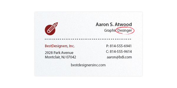
If you ignore everything else we say, at least hear this: proofread your design. One typo can render a business card entirely useless—meaning you and your client just wasted a lot of time and money. Always, always review your typography, formatting, and artwork.
No “freebies”
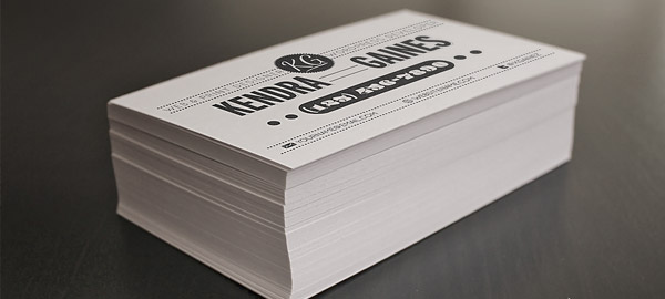
Image Credit: Giallo
If your client finds someplace that offers “free printing,” be wary. It sounds too good to be true—because it is. The print job may be free, but the back of the card will become a mini-billboard for the printer’s ads. Promoting another company on their own business card makes your client look cheap and unprofessional.
If they want to save money, suggest that they order more cards. Most of a printer’s costs come from set-up expenses, so the more cards your client orders at once, the lower the cost per card.
Download and share this business card cheat sheet

This work by Company Folders, Inc. is licensed under a Creative Commons Attribution 4.0 International License.
Embed this graphic on your site
One last thought
One of the best parts of your job as a designer is that you can rock people’s expectations. Instead of the same old boring designs, you can create a totally unconventional business card that people will want to hold onto for years. That sort of card isn’t just an investment in the business it represents. It isn’t just an extension of the cardholder’s personality. A truly phenomenal business card is one that starts a conversation—and keeps it going. Check out our business card printing services and get started today.
Have questions about how to design a business card? Have design tips or an example of an exceptional business card? Share it all in the comments!



Hello Vladimir,
I really like how you recommended that logo design should be protected by including, at least, a 3mm bleed area.
Thank you for sharing!
So many fun business car ideas! I loved looking at these different visually appealing ideas and hope that I can get some inspiration from this. I am starting to design my own business cards and I want to make a professional statement. I like your idea to use different materials for the card; like recycled material or chocolate! Thanks for sharing.
I think QR code is not necessary to put in contact information, and what’s the purpose of QR code?
Hi Abel,
That’s a great question. QR codes are a way of connecting your print marketing (business card) to your web marketing (social media profiles or business site). Your customers can just scan the code with their mobile phone and view your site right away, rather than taking the time to type in a URL that’s printed on the card. One important thing to remember is that not all contact information works for all businesses or appeals to all audiences. A QR code might be a great thing to include on a card if you want people to visit your website, but it probably won’t be very helpful if you’re trying to attract customers to a storefront. You should always choose the mode(s) of contact that work best for your brand and your clients; we recommend putting 1-3 types of contact info on a card so people don’t get overwhelmed by too many options. So if a QR code doesn’t work for you, stick with the types of contact info that your clients like best. If you think it might be helpful, we’d encourage you to give it a try!
Hope this helps!
Hi Vladimir,
I really appreciate this article, thank you for sharing this to us. Actually I’ve been apply some of those design ideas to my previous projects but the other are new to me. So, I have to utilize those new to me so I can come up an upgraded one.
Wow! Great information. I appreciate the information , but a big thank you for including images! I had no idea there were so many different types of business cards available. You just got me thinking about printing new business cards for the New Year. Bravo! Oh, the cheatsheet was great!
Where do you recommend getting your business cards printed? Primo Print, Vista Print or someone like Moo? Thanks!
Hi Richard,
Thank you! While the sites you mentioned are options for ordering business cards, you run the risk of receiving lower quality products. Mega-printers are focused on fulfilling really large orders, really fast, and this can cause issues with things like color matching or cropping. Your best bet is to order high quality, custom business cards from a smaller print shop (like ours!) You can check out our custom business card design services here.
Thanks for the response. That’s something to look into for sure. Much appreciated!
I keep my design simple and elegant. The utilization of white space in the card design will make your card look attractive. Although, asking the customer about the require color will help you to select the right color for your design. I normally prefer to design my cards with the help of illustration given on the online websites.
I really like the way you have presented your experience. Using your tips in my next project.
Thank you
There are some very good points in your post and the comments so far. For me the core is the quality of the paper/card. No matter what finishing you have the card will not ‘feel’ professional or last in a wallet. The big online ‘cheap’ printers invariably supply lower quality paper and print for business cards and stationery, that’s their game.
Great list of the idea. I especially like the idea of not printing out more cards because they claim you can save more money. If you don’t need the cards, you’re not saving money but wasting money.
I really appreciate this article, thank you for sharing this to us. Actually I’ve been apply some of those design ideas to my previous projects but the other are new to me. So, I have to utilize those new to me so I can come up an upgraded one.