When we listed our choices for the worst fonts ever, we were surprised to find out that many of you disagreed with some of our selections. We received several comments from readers who saw value in the fonts that we ridiculed or thought we had unfairly judged some of the fonts we selected.
But it’s something we should have expected—after all, that’s the power that fonts have on people. Just the act of looking at a certain font face can involuntarily stir up powerful emotions or instill a sense of nostalgia. This is why a font like Comic Sans can be so hated by designers and yet so widely used; because Comic Sans was designed to feel fun and playful, and that’s a tough emotion to resist.
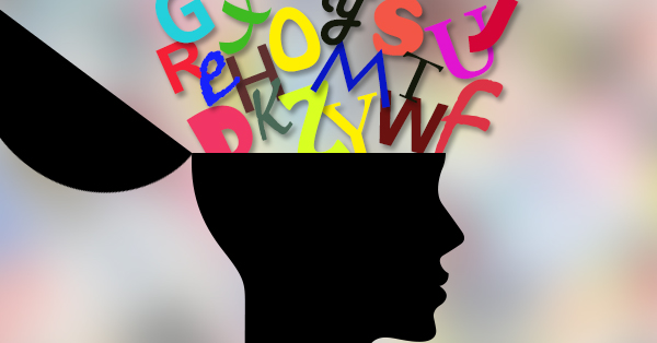
If you want to choose a font that generates an emotional connection between your audience and your design, you first have to understand the psychology of fonts.
How readers perceive fonts
Consider the Walt Disney logo design—ask any six-year-old to identify the logo, and they’ll know exactly which business it belongs to. But ask the same child to identify the individual letters in that script font, and you’ve got a problem. Even that first letter “D” looks more like a backwards letter “G.”
Disney’s logo is instantly recognizable, but it’s also not especially readable.
So why does a company like Disney actively market to six-year-olds using such a complicated, hard-to-read script font? It’s because of a psychological theory known as the Gestalt principles of design, which say that the brain tends not to focus on the individual pieces of a design, but rather applies a universal understanding to the design in its entirety.
So in the case of the Walt Disney logo, the six-year-olds in the audience aren’t actually reading every single letter, they’re looking at the entire word as a whole and applying meaning to the entirety of the logo. The font may not be very readable, but it carries an emotional weight to it and delivers a subconscious message of whimsy and nostalgia. These emotional values are much more important to the brand’s identity than legibility.
Creating personality from fonts
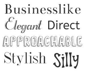 In print media, your best opportunities to utilize fonts with an emotional impact are in the logo and the headline text, because these are the only times when emotion matters more than readability. Emotions create personality, which is what is what elevates a font from just text on the page to a serious visual design component unto itself.
To help you better understand, we’ve decided to put our own logo under the microscope to show you how your font choices can have a drastic impact on the personality you convey to the audience. Our normal logo is a sans serif font, which we feel matches our personality as a friendly, modern, forward-thinking brand. When you change the font on our logo, it radically changes the audience’s perception of our brand.
Serif
- Traditional, respectable, stable
![]() Serif fonts carry a distinguished feeling of heritage and pedigree. They make a brand feel respectable and reliable, instilling the audience with a sense of comfort that they’re in the hands of someone reputable and stable.
Serif fonts carry a distinguished feeling of heritage and pedigree. They make a brand feel respectable and reliable, instilling the audience with a sense of comfort that they’re in the hands of someone reputable and stable.
When you add serifs to the Company Folders logo, it makes the brand seem stoic and traditional. It would make for a fitting logo choice if it were more closely aligned with our brand identity, but this font (Heuristica) is a little too uptight and old-fashioned for our tastes.
Sans serif
- Simple, straightforward, sensible
![]() Audiences perceive sans serif fonts as clean and simplistic in a modern way. They allow the message to speak for itself without hiding behind a façade—straight and to the point in an objective way. Sans serif fonts are typically used in digital design, so they carry a reputation for being contemporary and current no matter what decade you use them in.
Audiences perceive sans serif fonts as clean and simplistic in a modern way. They allow the message to speak for itself without hiding behind a façade—straight and to the point in an objective way. Sans serif fonts are typically used in digital design, so they carry a reputation for being contemporary and current no matter what decade you use them in.
Our logo is already a sans serif font, so it felt like cheating to just show you the same logo all over again. This time, we choose a different sans serif font (Caviar Dreams) to show you how even two fonts in the same font family can create completely different emotional messages. The new font feels a little more direct (but also a little less friendly) than our usual logo.
Script
- Personal, feminine, fancy
![]() Script fonts (and by extension most handwritten fonts) inspire feelings of elegance, grace and femininity. Handwriting is often used in expressions of affection, so audiences perceive these typefaces as personal, creative and genuinely heartfelt.
Script fonts (and by extension most handwritten fonts) inspire feelings of elegance, grace and femininity. Handwriting is often used in expressions of affection, so audiences perceive these typefaces as personal, creative and genuinely heartfelt.
Adding a script font (Carrington) to the Company Folders logo transforms it into something that would be more appropriate if we sold greeting cards instead of presentation folders. It may look pretty, but it delivers the wrong message about our brand and the type of work that we do.
Display
- Friendly, quirky, unconventional
![]() Since display fonts are meant to be, well, displayed at a large size (generally 14 pts. or higher), they tend to have big personalities in order to draw an audience. Display fonts have to be a little on the loud side, so they’re often designed to be friendly or amusing and grab people’s curiosity.
Since display fonts are meant to be, well, displayed at a large size (generally 14 pts. or higher), they tend to have big personalities in order to draw an audience. Display fonts have to be a little on the loud side, so they’re often designed to be friendly or amusing and grab people’s curiosity.
We decided to use a really flashy display font (Bigfish) in our example to show how drastically different it is from our normal Company Folders logo. It’s certainly eye-catching, but not in a way that’s authentic to our brand. We like to have fun, but this is a little too zany.
Modern
- Smart, trendy, forward-thinking
![]() Audiences find modern fonts to be progressive, stylish and just plain cool. They can run the gamut from strong and sharp to futuristic and intelligent. They don’t just reflect the here and now, they set trends and the brands that utilize them carry the same reputation with audiences. Modern fonts reflect the possibilities that tomorrow may bring.
Audiences find modern fonts to be progressive, stylish and just plain cool. They can run the gamut from strong and sharp to futuristic and intelligent. They don’t just reflect the here and now, they set trends and the brands that utilize them carry the same reputation with audiences. Modern fonts reflect the possibilities that tomorrow may bring.
We’re a modern company, so replacing the Company Folders logo with a modern font (Prototype) doesn’t look half bad. However, it’s a little too technical and almost seems like something you might see in a sci-fi movie. It’s Silicon Valley meets Star Trek-not quite right for a company that sells printed products.
Decorative
- Fun, unique, casual
![]() Decorative fonts are highly stylized and out of the ordinary, bringing fun and joy into a design and relaxing audiences with an informal atmosphere. They’re best judged on a case-by-case basis because the implications of the design can change from font to font.
Decorative fonts are highly stylized and out of the ordinary, bringing fun and joy into a design and relaxing audiences with an informal atmosphere. They’re best judged on a case-by-case basis because the implications of the design can change from font to font.
Since the decorative font in our example (Impact Label) is designed to represent office labels, it conjures up feelings of organization and authority by reminding the audience of official documents or office culture. It’s actually quite fitting for a company that sells presentation folders-but you have to be careful with decorative fonts. Some recipients might instead associate this look with a punk rock, underground, DIY aesthetic. Decorative fonts can be an emotional minefield if you’re not careful, and you have to be sure your audience is going to respond to them the way you want them to.
Other persuasive font techniques
Understanding font psychology takes more than just knowing what emotional baggage the audience carries with regard to certain font families. There are other subconscious effects a font can have on the brain. Knowing how the human brain deciphers and perceives a certain font can help you to unlock its true potential or avoid any hidden pitfalls that might hinder your message.
Familiar fonts build trust
The more familiar your audience is with the font you choose, the more likely they are to trust you and the message that you’re trying to convey. This is why even with so many font choices to choose from, many designers just stick to the classics like Helvetica and Impact. Deviate too far from the norm and you risk alienating your audience.
This doesn’t mean you have to make your designs blend into the crowd by choosing the same fonts that everybody else is using, only that some level of familiarity helps to gain the audience’s trust. Rather than using Helvetica specifically, you could use one of the many fonts derived from or inspired by Helvetica to stand out while still capitalizing on your viewer’s familiarity.
Consumers didn’t care much for Gap’s short-lived logo font change.
Keep in mind that any font choices you make may stick with the brand for a long time. Consider how people initially respond any time a famous brand changes the font in their logo-usually with disdain and a desire for a return to the old look. Gap, for example, met with a huge backlash on social media when they switched their well-known logo to a sans serif design. The negative response was so strong that they ended up changing it back within a week.
Utilizing the same fonts across multiple platforms and projects will build familiarity with the audience and keep the brand identity cohesive.
Fonts can affect other senses
You may not realize it, but the fonts you choose can affect more than just the audience’s sense of sight. A recent TED talk from designer Sarah Hyndman revealed that people tend to associate fonts with specific smells and tastes.

Knowing how fonts active your audience’s senses and sense memory can help your design better deliver its message. For example, people find menu items more appetizing (and even find that the actual food tastes better) when they’re written in a font that complements the food’s flavor.

A similar effect can apply to audience’s sense of sound, which is why a classical music album is considerably more likely to be printed with a script font.
Keep your recipients’ senses in mind when choosing fonts. If you’re marketing a brand of gasoline with a flowery, delicate typeface more suitable for a perfume, it’ll only confuse your audience.
Complex fonts can actually be more effective
Like we said before, you don’t always have to worry about using a complicated, hard-to-read font in a logo because thanks to Gestalt principles, audiences will perceive the logo as a whole idea rather than its individual parts. However, you might also want to consider using a complex font when delivering a direct message for the exact opposite reason—because forcing the audience to ignore the Gestalt principle and focus on the individual parts helps them to engage more directly.
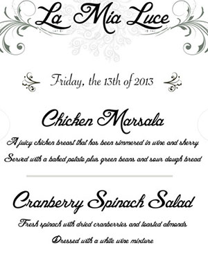
When a menu is more difficult to read, it helps create the impression that the food is more difficult to make. Photo Credit: Gabe Laulunen
This can be a dangerous game to play and you certainly have to know your audience to make it work, but when a font requires more work to decipher, it forces the audience pay attention.
That doesn’t mean you should always use some incomprehensible decorative font, just that there are certain opportunities when you can use this to your advantage.
Consider using more complex fonts when you want to give your reader the impression that a great deal of effort or skill is involved with whatever you’re talking about. For example, if you’re describing how an expensive product is made, a font that’s arduous to read will make the audience more receptive to the idea that what you’re selling takes a ton of hard work to create.
This is part of the reason why expensive restaurants often use especially hard-to-read typography in their menus.
The final word on font psychology
What we’ve provided you with are merely guidelines, but there’s no such thing as a one-size-fits-all approach to typography. You have to approach each situation differently because every situation is going to be different.
Before you commit to a font, see how others perceive it—for all you know, you might have your own emotional baggage you’re attaching to a font that’s making you connect to it in a different way than others do.
What do you look for in a font? What fonts do you see as trustworthy or stylish and which ones are you wary of? What do you think Times New Roman tastes like? We want to pick your brain, so leave a comment below!


This combination of design with psychology is particularly interesting. Are you aware of a more extensive “dictionary” of fonts and their psychological implications?
I don’t know of any as extensive as a dictionary, but this post is interesting as well: https://www.crazyegg.com/blog/font-psychology/
Oh boy…anyone ever stop to think some are just easier to read? There doesn’t need to be any “psychology” involved. And nothing on a menu would draw me to it more because of a font – it might make it more difficult to make out, though. In short, it is baloney.
As a budding graphic designer, I find this article very helpful! 🙂 It is thorough and explains well the things I want to know about fonts. Still, I wish I could learn more! 😀 Thank you so much for this informative article.
Really interesting article, I’ve been researching a bit about this, but unfortunately, it still seems that any discussion relating to fonts tends to be very subjective. I don’t think that the font design is what makes it evoke a specific feeling, it is the associations each individual makes. Without the association of the round font with some or other brand of candy, the font won’t “taste” sweet at all. If the candy you know had a serif font logo, you would associate that with candy instead. Of course, for a specific audience, it is reasonable to make such assumptions, it’s likely people from the same region/generation would make similar associations. Well, I’m not saying anything new here, and the article makes me think more of how these associations are formed in the first place, and how these can change in the future. It can even be fun to swim against the current and use fonts that evoke conflicting associations so that it forces the perceiver’s brain to think a bit harder about what he is perceiving.