If you were one of those students who loved art classes but hated math, it was probably a shock to the system when you found out just how much math you’d end up using as a professional designer. In fact, math skills are absolutely essential for print design—at the very least, you need to know how to measure out your bleed area and understand the physical size of your canvas.
But if you’re willing to understand more than just the mathematical basics, you can use those numbers and measurements to turn a design into a thing of beauty. Understanding the rule of thirds in design is relatively simple, but this one concept can make you a significantly stronger designer. Don’t worry—you don’t need a PhD in applied mathematics to understand the rule of thirds. Just read onward to find out how easy it really is.
How the rule of thirds works
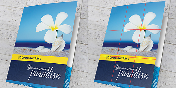
The rule of thirds simply states that if you take a canvas and divide it into three equally sized horizontal sections and three equally sized vertical sections, the resulting grid provides a sort of “roadmap” that helps you choose where to place your design elements. Any graphic design software worth its salt (including Photoshop) can apply a rule of thirds grid to your canvas and crop accordingly, but grids are easy enough to make on your own—you could even draw it directly onto a printed design if you wanted to.
The rule of thirds grid can be applied to any folder size—the grid itself doesn’t have to be any particular dimensions. It just has to be evenly divided into three vertical and three horizontal section. This creates a 3×3 grid—kind of like the opening title card of “The Brady Bunch.”

That doesn’t necessarily mean you’ll end up with nine equally-sized squares. If your design isn’t a perfect square, you’ll probably be splitting it into nine rectangles.
Keep in mind that when you’re working with a print graphic design, you need to measure your rule of thirds grid according to the visible sections of your canvas. If you measure out from the bleed areas, you might end up with a grid that places key elements too close to the edge of the page for comfort.
Finding the ideal focal point
So now that you have your rule of thirds grid built, what do you use it for? Think of your grid as a sort of map—the spots where the lines intersect indicate the prime focal areas within your design. Bringing an element closer to one of these intersections will allow it to stand out more, while objects that are further away will receive less attention.
Audiences tend to follow a capital “F” shaped pattern with their eyes whenever they look at a design. The eye naturally starts at the top left section of the canvas, then moves down to the bottom left, back up to the top right, and then finally the bottom right.
But this doesn’t mean that the top left intersection is prime design real estate and the rest of the canvas is useless. Rather, the rule of thirds should act as a guideline that helps you achieve visual balance and interest. For example, an element in the top left part of the grid will seem nearly equal to an element that touches both the top right and bottom right intersections.
Using the rule of thirds to create visual interest
The rule of thirds grid gives you the chance to give your graphic design a perfectly symmetrical appearance—but you’ll want to squash that instinct. While it’s true that humans are naturally attracted to symmetry, it’s also the easiest way to go unnoticed because we’re used to seeing it all the time. Making something asymmetrical sends a signal to our brain that something is different, which makes us more likely to engage.

While symmetry isn’t always necessary for good design, balance absolutely is. The rule of thirds grid is also one of the best tools to help you figure out how to use asymmetrical balance to your advantage. If your design is imbalanced, it throws off the entire look. Using a rule of thirds grid helps you maintain good balance while still keeping things asymmetrical.
That’s because with a rule of thirds grid, you know which parts of the canvas have the most weight. If you have something important on the bottom left intersection, you don’t want something on the top left intersection overshadowing it. But on the other hand, the bottom left and top right intersections are pretty much equally matched, so focusing elements in these areas creates easy balance.
Rule of thirds in photography
Photography is one of the areas of design where you really want to pay attention to the rule of thirds. Fortunately, modern technology has made this easy for designers. Most digital cameras have an option for a rule of thirds grid, as do most camera phone apps.
Get into the habit of using this grid whenever you take photographs, even if you don’t use original photography in your print designs. You’ll start to get a feeling of where that rule of thirds grid exists, even when you don’t actually have it in front of you.
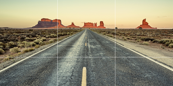
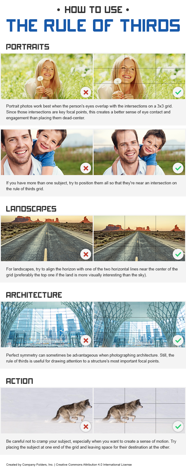
There are a few things to keep in mind when you take photographs using a rule of thirds grid. It’s best for the horizon in your photograph to line up with one of the horizontal lines on your grid. For landscapes, it’s usually best to have the horizon on the top horizontal line, so that the picture shows more of the subject matter and less empty space.
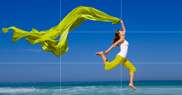
When taking a portrait, try to frame your photo so that one or more of the subject’s eyes are aligned with one of the intersections on the grid. The intersections represent the areas in your design that will have the most audience focus, so by putting the subject’s eyes in those locations, it’s like forcing your audience to make eye contact with your subject. It builds a stronger connection between the audience and your design, just as making actual eye contact with another person establishes a better social connection.

If you’re not taking original photography for your print designs, you can still apply the rule of thirds principle to the images you have to work with. Make use of cropping techniques to give them better composition.


This work by Company Folders, Inc. is licensed under a Creative Commons Attribution 4.0 International License.
Embed this graphic on your site
Creating motion using the rule of thirds
Asymmetry in design is a good thing, but when your design focuses more on one side of the canvas and neglects the other, it can create a sense of motion in your design. This can be either beneficial or harmful to your design, depending on what message you’re trying to convey.
Always keep in mind that you still need to maintain a sense of balance, and shoving all of your design elements into one area of the canvas may clutter it up. Movement in design is a bit like visual storytelling—you’re capturing a single moment in the journey from point A to point B. So your design has to give the audience a sense of where those points are.
Simply placing the subject on one side of the canvas won’t always be enough. But if that subject is mostly in one section of the grid with a limb or appendage that’s in a separate part of the grid, you’ll create the sense of where the subject is coming from and how their body is moving. Likewise, you could have a subject on one side but show their destination on the other, which shows the audience where the subject may end up.

How the rule of thirds applies to print
The rule of thirds goes beyond just the pictures and photographs that go into your print design—the grid can also be applied to most print templates, too.
The key word here being “most.” There are times when you might be working with a uniquely shaped custom media, in which case the grid won’t apply as much because you won’t be able to evenly divide the canvas.
But you can still apply the rule of thirds to most print media layouts to ensure that the most important aspects of the design are seen by the audience. Keep in mind that audiences will still view the page in that “F” shaped format, starting at the top left intersection, then going down and across.
If you’re using an image for your background or if a large photograph takes up the majority of your canvas, then applying the rule of thirds to your print design really won’t be any different than applying it to a photograph or other image.
Just always keep in mind that the rule of thirds applies to each page individually for folded materials—don’t apply it to your entire flattened print canvas. Instead, treat each panel of the marketing collateral as its own separate canvas when utilizing this technique.
Why you shouldn’t design with a rule of thirds mentality
So now that we’ve spent all this time going over the rule of thirds, we’re going to ask you to do something a little controversial—put it out of your head.
At least during the initial design phase of your project, anyway. The more you work with the rule of thirds, the more it will come naturally to you over time, so there’s no need to force the issue too much. Good design tends to satisfy the rule of thirds whether you intended it do so or not.
That’s why this is something you should only really concern yourself with near the end of your design. It’s a tool to help you tweak your design, not something that you should have to actively concentrate on at all times. It’s one thing to use the rule of thirds grid when snapping a photo or when editing that photo later, but it’s another thing to start with the mentality that your ideas have to “stay within the lines,” so to speak.
There are so many other crucial factors that a designer has to worry about when it comes to creating a print design. The rule of thirds shouldn’t be a primary concern—it should be more like a cheat sheet you check after the work is done to make sure you’ve gotten the right answer.
Rules are made to be broken
But there’s an even better reason why you shouldn’t start your design with a rule of thirds mentality: because sometimes you have to break the rules to come up with a truly original design.
The more you understand the rule of thirds and the effect that it has on how the audience perceives your design, the easier it is to exploit it to subvert the audience’s expectations. For example, we know that the upper left intersection is where all the action is at, so experimenting with the other areas of the canvas is a good way to open yourself up creatively. Forcing the audience’s eye to look where it doesn’t normally look can be risky, but that risk comes with high reward.
But again, you can only gain this kind of creative freedom if you understand how the grid works and how the audience responds to it. You basically have to use the rule of thirds in order to work against it—you can’t just create some sort of chaotic layout and expect it to be interesting.
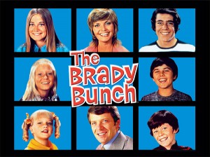 When designers work against the rule of thirds, they’re still using that grid in some way or another. Think about our video example from The Brady Bunch—in the intro to this classic sitcom, we actually see the rule of thirds grid. But the characters themselves are all equally placed around the grid—nobody is actually touching the intersections.
The result is that each character gets equal consideration—that is, until the logo comes in and overlaps all four intersections. It’s even heavier near the top left and bottom left intersections, creating a lovely asymmetry in the areas where a viewer is most likely to look. There’s only the illusion that the rule of thirds doesn’t matter, when really, the grid design is set up to trick the audience into focusing less on any one member of the cast and instead on the brand as a whole.
So how could an example of the rule of thirds in film translate to print design? Well, imagine something like a presentation folder that did something similar using die-cuts. Your front cover could work against the rule of thirds with design elements that exist “off the grid,” but when you open it up, it might reveal an even bigger design—one that satisfies the rule of thirds.
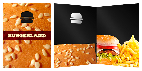
In this case, going against expectations on the front cover shows the audience that there’s something more interesting to be found inside. And then when you satisfy their expectations after they’ve opened the folder, it creates a sense of relief and builds a stronger connection to the design.
Your Turn
Now that you understand a little more about the rule of thirds, you’ll probably start to see it everywhere. Don’t worry, this might drive you a little nuts, but it’s still a good thing. It means you’re developing an eye for good design, which can only help you in the long run.
It also means you’ll be a little more ready to understand more advanced concepts such as the golden ratio—an equally important, albeit slightly more complex rule of aesthetic design.
Sometimes the best way to learn a tenet of design is through example, so we want to see some of your best examples of designs that utilize the rule of thirds—whether they follow or subvert it. Leave your examples in the comments below!


You have some great tips for graphic designing. I love the way you explain how to use the rule of thirds, and the examples you have. The proper placement of your subject in a design can really make a big difference! I also like how you talked about not always going by that rule though. It’s a fine line.
Just had a conversation with a client that I’m working with on a logo design. He is one of those clients that has general knowledge about a lot of different subjects, and apparently design is one of them. In our latest project review, he asked me to make a new iteration of the design in which I utilize the rule of thirds on a particular element of the logo. I should have taken a moment then and there to consider what he was requesting and why it won’t ultimately make much of a difference in the final design, but as I often do, I instead said I would go back and play with the idea. Now I am searching the web for some thoughts on this concept as it relates to logo design specifically, so I ask you – What are your thoughts on the rule as it relates to this specific area of design (logo development)? Great article!