
We see them every day—in our homes, on TV, out in the street. They’re the famous logos of the brands we’ve come to know and love. These logos not only accurately represent the famous brands they’re attached to, they’ve become a part of our shared pop culture. Heck, someone even made a short film with logos and mascots comprising all of the characters, props and scenery.
Logos are practically enshrined by our society, and yet they were designed by people just like any other piece of graphic art. Getting to that upper echelon of the design world takes a lot of hard work, a lot of creativity and just a little bit of luck. Just about every major corporate logo has a fascinating story behind it.
For that purpose, we’ve rounded up some of our favorite world-famous logos with hidden meanings, secret truths and exciting origin stories behind their design.
Adidas
 Conquering the mountain
Adidas has always been known for its simple three-stripe logo, the simplest form of which was first created in 1976. Back then, the three Adidas stripes were just three stripes and they didn’t have much meaning behind them—the brand just wanted something unique that would look good on a shoe.
In the 90’s, the logo was tweaked further and the three stripes were turned diagonally on their side to create the shape of a mountain peak. The new design kept the basic idea of the original logo while giving purpose to those three stripes, which now represent the struggle athletes must endure to achieve greatness.
Amazon
 Everything from A to Z
Upon first glance, what most people see in the logo Amazon has used since early 2000 is a smiling face, associating the brand with happiness and giving it a positive connotation. But that smiling face is doing much more than giving the audience emotional cues—it’s also delivering a subliminal message.
The smile itself is in the shape of an arrow that points from the letter “A” at the beginning of the word “Amazon” to the letter “Z” in the middle. This is to signify to the audience that Amazon sells “everything from A to Z.”
Apple
 An apple is just an apple
Even though the original logo for Apple featured an image of Sir Issac Newton, the father of gravity is not actually the reason why the fruit was picked to represent the computer company. The name Apple all comes down to a simple explanation—Steve Jobs liked the sound of it.
A lot of urban myths surround the Apple logo, one being that the bite mark represents the apple of knowledge from the Garden of Eden. But the logo has an equally simple explanation as the company’s name. The logo is in the shape of an apple because the company is named Apple and the bite mark is only there to give the logo scale—otherwise, people might confuse it for a cherry.
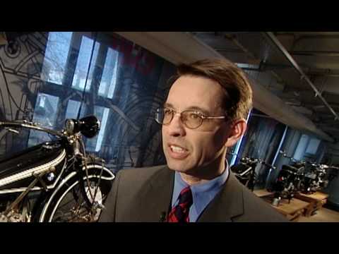
BMW
 The accidental propeller
The German car company BMW was once known for creating more than automobiles—they created aircraft engines, too. This has led many to believe that the white and blue checkered logo is designed to signify a plane’s white propeller with a blue sky behind it.
While this makes for great branding today, this was not the original intention for the design.
Back in the day, BMW wanted to use the colors of the Bavarian Free State in their logo, but doing so was illegal, so they reversed the colors and accidentally created the propeller design.
Chupa Chups
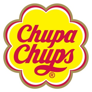 The surrealist sucker
Salvador Dali was a modern artist known for his work in surrealism, cubism and Dadaism, but he’s also known for being the kind of artist who doesn’t look a paid gig in the mouth. Case in point: he’s the designer responsible for the logo for Chupa Chups lollipops.
The text had already been established by the time Dali got his hands on the logo, but he was the man behind adding the flower shape behind the text. He also had the idea to move the logo to the top of the lollipop wrapper instead of on the side. This way, the logo would always be intact and visible to the consumer.
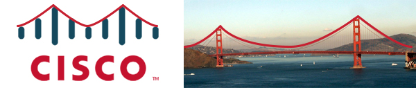
Cisco
 Know your roots
Cisco Systems is known for their telecommunication equipment, so it makes total sense that they’d choose a symbol that represents electromagnets for their logo. However, what many people don’t realize is that the electromagnetic waves are in the shape of the Golden Gate Bridge. Why? Because Cisco is extremely proud of their birthplace.
The company was founded in 1984 in San Francisco, so the Golden Gate Bridge shape is an homage to the company’s roots. The name “Cisco” itself is even taken from “San Francisco” (which is why it’s not capitalized in the logo).
DC Comics
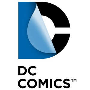 Peeling back the layers
When movies based on comic books began to become a big box-office draw, DC Comics decided to update their logo to represent the entirety of their media group, which expanded beyond comics.
The new logo drew outrage from the fanboy crowd on the Internet, but was a bold move for the brand in moving towards a new direction.
The logo itself features the letter “D” being peeled back like a page to reveal the letter “C” as a nod to the comics that started it all. DC also changes the logo’s aesthetic appearance to match whatever characters or properties the company is promoting.
Domino’s Pizza
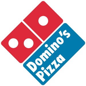 The numbers game
Everybody knows the Domino’s Pizza logo is based on a domino playing piece—it’s right there in the name, after all. But what you might not know is that there’s a lesson to be learned from the Domino’s Pizza domino—and that lesson is not “Avoid the Noid.” The three dots in the corporate logo represent the original Domino’s Pizza restaurant and the first two franchise locations that were opened after.
However, the original plan was to keep adding dots every time a new franchise opened. This plan was abandoned after the first two franchises were opened (and considering that there are now over 10,000 Domino’s stores, we think that was probably a smart move).
FedEx
The buried arrow
On the surface, there’s not much going on with FedEx’s iconic logo—it’s just the name of the company in two different colors. But if you look at the gap formed between the letters “E” and “X,” you’ll see a hidden arrow in the negative space. Once you see it, you can’t unsee it; the arrow signifies that the company is always moving forward.
![]()
The colors used in the FedEx logo actually vary for the different parts of the company. Every logo features a purple “Fed,” but the “Ex” comes in different shades—gray for FedEx Corporate, orange for Express, green for Ground, red for Freight, blue for Critical and yellow for Trade Networks. The brand essentially has enough color variations in its logo design to create its own team of Power Rangers.
Gerber
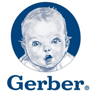 The gurgling Gerber baby
The Gerber brand is synonymous with babies, thanks in part to the world-famous Gerber Baby that adorns all of the company’s products. The company actually began life as the Fremont Canning Company and when owner Daniel Frank Gerber got the idea to sell strained vegetables and fruit as canned baby food, he put out a call for open submissions to find the Gerber Baby.
The winner of the search was Dorothy Hope Smith of Boston, who sent in a sketch of her neighbor’s baby, Ann Turner Cook. The sketch was actually unfinished at the time and Smith offered to finish it, but it was used as-is and hasn’t changed since 1928. The Gerber Baby was so popular that the company changed its name to Gerber to match.
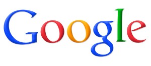 A touch of green
The Google logo might seem pretty basic on the surface—after all, it’s just the company’s name in a clean, colorful font. But when you start adding up the colors, you might notice something is a little off balance. The Google logo uses the three primary colors, red, yellow and blue—and then there’s that green “L” near the end that throws the whole primary color scheme out the window.
The green color was added as a way to show the audience that Google is a little different, a little more unique than other companies. The four-color scheme signifies Google’s ambition to be an innovator, not a brand that does what’s expected. Today, that same color scheme is used in the logos for other Google products, such as the Chrome web browser.
IBM
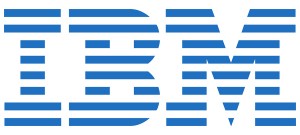 Equality for all
The IBM logo that we know and love has the three letters of the brand’s name written in a big serif font with horizontal lines of whitespace running through it, breaking the logo up. The reason behind the horizontal lines is due to the fact that early photocopies had difficulties reproducing large blocks of solid ink. The original logo had thirteen lines going through it, but that number was reduced to eight because (ironically enough) the original thirteen caused ink bleeding issues in the company’s print media.
The current logo also has a small secret message created by these horizontal line breaks. The bottom right corner of the logo is broken up in such a way so that the serif on the bottom of the “M” displays an equal sign, representing the value of equality.
McDonald’s
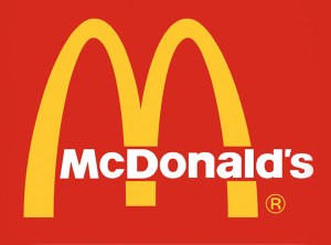 The golden mammaries
Most of us go through life thinking that the McDonald’s logo is supposed to be the letter “M” for McDonald’s. But the original golden arches were actually a part of the building design for the restaurant chain. The arches connected to an overhang that kept the rain off of customers when they were ordering outside. The company discovered that those golden arches were easily seen from the freeway, which drove people to the restaurant. This is partially why the golden arches are still used as a symbol of the brand today.
That “M” shape also has a risqué hidden meaning—it represents a pair of breasts, a symbol of nourishment for us mammals.
Mitsubishi
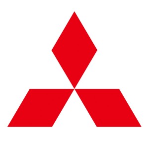 The three diamonds
The Mitsubishi logo goes back to 1870’s Japan when the Tosa clan acquired the Tsukumo Shokai shipping company from the Iwasaki family. The Iwasaki family crest was a set of three stacked rhombuses, which are referred to as chestnuts in Japan. The Tosa family crest was represented by a three-leafed oak symbol.
These two family crests were combined into the three diamond shape we see today. The Tsukumo Shokai company was soon rebranded as Mitsubishi, which is a combination of the Japanese words mitsu (which means three), and hishi (which means water chestnut and describes the diamond shape). Thus, Mitsubishi essentially means “three diamonds,” a literal description of the brand’s corporate logo and a link to its storied past.
![]()
NBC
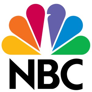 Proud as a peacock
The NBC peacock is another example of a logo that uses multiple colors, but there’s a practical reason why such a colorful logo was picked—to sell more color TVs. The NBC peacock debuted in 1956 during a time when the network was owned by RCA. To celebrate their new color TVs, the company adopted the colorful peacock as their logo, which could only be fully experience on a color TV.
In 1986, during the network’s 60th anniversary celebration, they revealed the modern-day peacock logo that we’re all familiar with. The simplified design featured six tail feathers (each in a different color) to signify the six divisions of the business. The peacock was also turned around so that he’s facing to the right—pointing forward to the future.
Nike
 The $35 “swoosh”
The story of the world-famous Nike Swoosh logo is a great lesson for designers to keep in mind. The designer of the Swoosh, Carolyn Davis, was actually a design student when she created the logo for the company and was only paid $35 for her contribution. This might seem like a cautionary tale for young designers, but at least it has a happy ending—later on, when the business grew, Davis was retroactively compensated for the design with a diamond ring in the Swoosh design and 500 shares of Nike stock.
The logo itself was created as a response to the simplicity of the Adidas logo. The Swoosh shape was designed to convey a sense of motion, but it had to be simple enough to compete with Adidas and look good printed on the side of a shoe.
Paramount Pictures
 A star-studded mountain
There must be something about mountains, because three of the logos on our list feature a mountain peak in their design. The Paramount Pictures logo was actually created by the founder of the business, William Wadsworth Hodkinson. Legend has it that he sketched the logo on a napkin and that the mountain peak is Ben Lomond Mountain.
The original logo was surrounded by 24 stars, representing the 24 actors and actresses that were signed with the studio; the 24 stars literally represented 24 movie stars. These days, the number of stars has been reduced to 22—but the number of movie stars employed by the studio is obviously much higher than that.
Pepsi
 The smiling globe
The Pepsi logo (officially known as the “Pepsi Globe”) was originally created in the 1940s during World War II. The patriotic red, white and blue colors were chosen to show support to the troops overseas and were only printed on the bottle caps, while the bottles themselves still had a classic script logo. By 1945, the Pepsi Globe became the official logo, due in part to the widely successful appeal they had with consumers.
Since then, the Pepsi Globe has evolved but it’s maintained its patriotic color scheme. The most recent iteration was updated in 2009, which changed the white portion into a “smile.” Each Pepsi product has a different smile shape—for example, the Diet Pepsi “smile” is smaller than the original Pepsi “smile.”
 Put a pin in it
The social media site Pinterest is a portmanteau of the words “pin” and “interest,” since it allows users to pin things they’re interested in to a board. Since the word “pin” and the act of pinning something to a board plays such a crucial part in the brand’s identity, the Pinterest logo has a pin design hidden in the letter “P.”
This pin-shaped “P” is used throughout the rest of Pinterest’s branding, including its social buttons. It’s also used in the phrase “pin it,” which is frequently used to draw attention to media that can be pinned to a Pinterest board. All of these hidden “pins” are designed to get people pinning things by mimicking the action of pushing a real pin into a bulletin board.
Starbucks
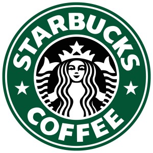 The salty siren
Practically everybody knows that Starbucks hails from Seattle, a city known for its seaport origins, so when it came time to pick a logo for the business, they decided to keep close to their roots and choose a symbol of the sea. The original logo was from a 16th century Norse woodprint of a naked siren with two tails.
The image of the Starbucks siren has evolved over time—for starters, you can no longer see her naked breasts. The logo was recently redesigned so that the image of the siren is closely cropped, making it so that you can barely tell that she’s naked at all.
Toblerone
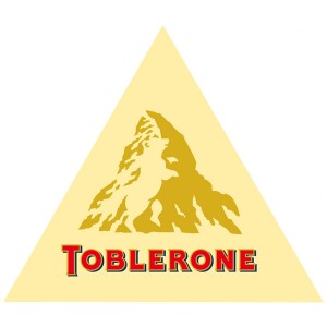 The bear in the mountain
The Swiss chocolatiers at Toblerone are known for their unique triangle-shaped chocolate bars and their logo featuring a picture of the Matterhorn, symbolizing the product’s country of origin. Although it would seem like the shape of the product and the triangle shape of the Matterhorn peak would be connected in some way, it’s actually just a happy coincidence—the shape of the product came from the shape of a human pyramid, not mountains.
But there’s something hidden in that Matterhorn peak for the viewer with a keen eye. If you look at the white space in the mountaintop, you’ll see the image of a bear. Why a bear? Because Toblerone is made in Berne, Switzerland and the bear is the symbol for Berne. Even the word Toblerone itself is hiding all the letters to spell out the word “Berne.”
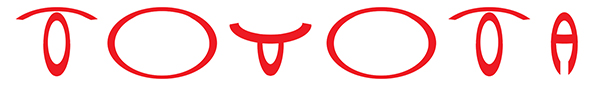
Toyota
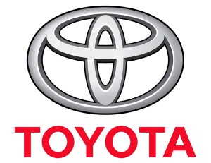 The heart of hidden symbols
Other than obviously looking like a big letter “T” for Toyota, the automobile manufacturer’s logo is composed of overlapping ovals, which represent the intersection of their customers’ and company’s hearts. Even the empty space behind the logo represents the boundless opportunities the future may bring.
With all that meaning, you wouldn’t think there’d be any room left for more symbolism, but you’d be wrong. Look carefully at the three circles that are used to create the “T” shape, and you’ll actually find every letter from the word Toyota hidden inside. The company’s entire name fits right into this one simple emblem, which is kind of important when you consider this is going on the grill of someone’s car.
Vaio
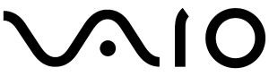 Old-school meets new-school
Sony is a company with a well-known history of making quality audio and video equipment, so when they created the Sony Vaio brand (which is now just known as Vaio) to sell computers, laptops and tablets, they chose a logo that would both represent their past and reach towards the future.
The Vaio logo combines imagery from both analog and digital electronics into one single element. The “VA” portion is in the shape of an analog waveform, while the “IO” represents the numbers one and zero, which are used in binary code.
Walt Disney
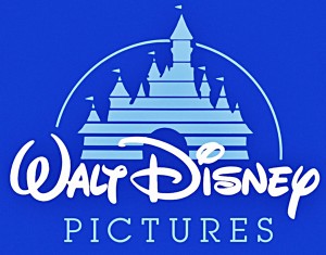 A fantastic forgery
We’ve already discussed how the Walt Disney logo is written in an intentionally hard-to-read script font, but what we didn’t mention before was how it’s also hard to write by hand. The common assumption is that the logo is based on Walt Disney’s signature, but it was actually created by a woman in his company, designed to tie into the Disney aesthetic of family-friendly fantasy and fun. This posed a problem for Uncle Walt, because when people asked for his autograph, they expected the one from the logo and his real signature didn’t look a thing like it.
By the way, the castle in the logo is typically Cinderella’s castle, which representing both Disney’s films and their theme parks (where Cinderella’s castle is also prominently placed). In some cases, Cinderella’s castle has been replaced by other castles. The movie Maleficent used Sleeping Beauty’s castle instead, for example.
Wendy’s
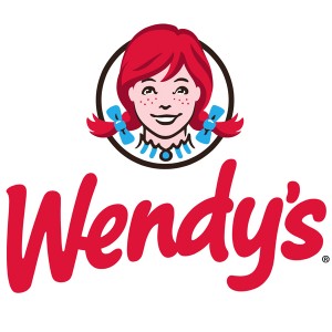 The pigtailed girl grows up
The modern logo for the Wendy’s fast food chain still features the red-headed, pigtailed mascot based on founder Dave Thomas’s daughter, Melinda-Lou “Wendy” Thomas—but it was recently given a makeover. The Wendy’s girl herself has been updated to look more like the actual Wendy (who is now a grown woman), so she’s a little older and a little less childish than before.
The collar of Wendy’s shirt seems to have a secret message spelling out the word “mom,” which one would think ties into the brand’s identity of selling old-fashioned hamburgers just like mom used to make. However, the company has come out to defend the new logo, claiming there’s no secret agenda. Considering the new Wendy’s girl is now a little older and dare we say, a little more motherly, you be the judge on whether the company line is actually the true story.
Your Turn
Want to add a hidden meaning to your brand’s logo? Our logo design services will help you restyle your logo to manipulate negative space or add a hidden meaning that plays on your brand’s name.
We’d love to hear your comments about the craziest hidden meanings you’ve ever seen (or created) in a logo! Share your thoughts below.

this was so weird, I can’t believe what I haven’t noticed! everything is such a mystery. Think about everyone who doesn’t know about the SECRET SYMBOLISM
Logos: Lego, Samsung, Burger King, Dairy Queen, Amoco, Holiday, Shell are more to research on. This article clearly allowed the reader to learn more info on the logos it presented.
The TOYOTA logo shows the Japanese ingenuity of having all the letters inside the logo. Just leave it to the Japanese. No wonder their cars successfully sold.
The Apple Mac logo with the bite mark represents original sin, evil, wickedness, deception.
In The Garden of Eden, Eve was tempted and deceived by Satan’s lies and led down a wicked path towards destruction, where she (against God’s instruction) took a bite of the “forbidden fruit.”
INTERESTING to NOTE:
The price of the first Apple Macintosh computer: $666.66 – “Mark of the Beast.” No Shame!
Fascinating to see this apparent affinity for, and alifgnment with, the Enemy/the Dark Side.
The first macintosh cost $2,495….
I heartily agree!
I highly suggest this to teachers to show this to their class!
if you flip the chicago bulls sign upside down it looks like a mad robot reading a book
The adidas sign looks like a sinking ship also