
Letters are very strange creatures. They’re the building blocks of our entire system of written communication, but when you get right down to it, they’re really just pictures. They deliver a direct message to the reader, but they’re also visual elements that can vary in color, shape and personality. This makes them especially popular when it comes to the look of a company’s logo; just a couple letters can convey a world of meaning. But it also makes them very tricky to work with.
Though it has unique advantages compared to other logo design styles, using a combination of typography as a visual component can be a tough tightrope to walk, especially when you want it to represent your entire brand. Make your letter-based logos (commonly called lettermarks or ligatures) look too much like conventional “pictures,” and they lose their ability to communicate a direct message. But if your letters are too plain-looking, they’ll fail to make a visual impact on the audience.
Fortunately, we’ve rounded up our favorite techniques for creating two-letter logos to help you out.
Sharing vertical strokes
One of the easiest ways to create logos with letters is to find two characters which can share the same stroke line—most likely a vertical stroke. You can choose between making each letter a different color to emphasis one over the other, or simply make both letters the same color to create one solid lettermark.

Image Credit: Courtney Lacy
Two uppercase
Uppercase letters tend to be most common for lettermarks, since that’s the case you’re most likely to use when writing out the first letters in the company’s name.
Nearly half of the letters in the alphabet have a perfectly vertical stroke at either the left or right end, so this is often a good place to start when sharing strokes.
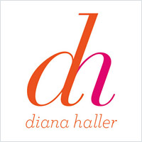
Image Credit: Diggy Dog Creative
Two lowercase
Sometimes it’s hard to find shared strokes between two uppercase letters, in which case you may find better luck switching over to lowercase.
Many lettermarks utilize lowercase letters, not only because the strokes line up easier, but because it creates a unique, lighthearted aesthetic that’s a little less serious.

Image Credit: Michael McCarthy
Lowercase uppercase mix
It may be poor grammar to use a lowercase letter in front of an uppercase letter, but you might have to bend the rules a little bit for the sake of design functionality.
You may find your ligature easier to connect if you use a combination of lowercase and uppercase letters, especially if the two letters share a stroke.

Image Credit: Chris Richardson
Blending straight and angled strokes
It takes different strokes to move the world and sometimes the letters you use aren’t quite alike, but are similar enough that you can fudge the difference by combining them. This usually means that some minor elements from each letter will have to be sacrificed to make them fit, but as long as the letters are still recognizable, this shouldn’t be an issue.

Image Credit: Alan Hannah
When working with letters that have angled strokes, for instance, it’s sometimes best to cut them in half before combining them with other letters. The audience should be able to fill in the blanks themselves and recognize the letter. Not only that, but it creates a stunningly minimalist look.

Blending curved and straight strokes
Curved letters like “O” can be problematic to connect with a ligature. You can sometimes crop part of the curved letter and still maintain readability, but sometimes it’s easier to bend the letter with the vertical stroke into a curved shape. The easiest way to connect curved letters is with a script font or one with a lot of curlicues.
Connecting crossbars
As opposed to sharing vertical strokes, sometimes the letters in a ligature can be connected by their horizontal strokes. Though these strokes have more specific, technical names, they’re often colloquially referred to as crossbars.

Image Credit: Jarod Richards
Top crossbars
Connecting at a top crossbar creates a sort of bridge between one letter and the next. In some cases, the letters can be connected between serifs, while sans serif fonts can create the illusion of one continuous letter.

Image Credit: Alireza Holding Co.
Middle crossbars
Crossing over in the middle will take a little more finagling, since the crossbar has to intersect one of the letters. Consider breaking up the letters by using alternating colors or by creating breaks of whitespace. You want to make sure that the individual letters are still legible—the crossbar should only connect them, not deform them into something altogether different.

Image Credit: Karla Lugo
Lower crossbars
There aren’t many opportunities to create ligatures using lower crossbars, since only a few letters have a horizontal stroke down there. However, if you’re using a serif font, you can stretch out the serifs to create a crossbar. As always, the letters should be somewhat distinguished from one another.
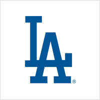
Image Credit: Los Angeles Dodgers
Crossbars at different levels
Your letters don’t necessarily need to be arranged on the same horizontal margin as one another. Placing them at different levels can create new opportunities for connecting crossbars. This is a particularly popular technique for sports teams and universities.

Image Credit: Dan Cederholm
Flattening out a curve
Curved letters can be a pain when you’re trying to connect them to flat letters. To rectify this, sometimes you have to pull that curve out. Just be careful which end you flatten—while you could flatten the letter “C” on either the bottom or the top to connect it to a letter, you could only flatten the letter “G” at the top without ruining the shape.
Removing and cropping
Sometimes getting two letters to work as a lettermark isn’t about adding something, but rather removing something in a way that ties them closer together.

Image Credit: LogoLuxe
Removing strokes
Sometimes you’ll have a better chance of combining letters if you remove a stroke from one of them at the point of connection. Just be sure that the letters are still readable after you remove the stroke. This technique seems to work best when you use a font face with thin strokes—thicker fonts look weird with a missing piece.

Image Credit: Julianne Adamko
Removing part of a stroke
If you find that you can’t get rid of a stroke without deforming the letters past the point of readability, you can always just remove a small section of it. You can either remove an entire section of a stroke (leaving the reader to “fill in the blank” with their own imagination) or you can create smaller breaks that allow letters with overhanging arms to be next to one another without overlapping to the point of being unreadable.
Cropping both letters
Don’t be afraid to take that crop tool and chop right through your lettermark. Sometimes it’s easier for the viewer to fill in the blanks if you’ve cropped all the letters instead of just one. This can help hide when you’ve got letters that don’t have the same visual weight to them by putting them at the same level and cropping out arms, strokes and ligatures that throw off the balance.
Using negative space
When you use negative space in interesting ways (such as including a hidden image), it compels audience to do a double take and examine the logo more closely.

Image Credit: Camille Myers
Adding negative space
Try creating at least one of the letters (or all of them, if you can pull it off) by adding negative space to a colored shape. With this technique, you can even put one letter inside the other by making one of them thick and cutting the other from negative space directly into the letter.

Image Credit: Rick Landon Design
Manipulating existing negative space
When using letters with a generous amount of interior whitespace (like “O” or “D”), you can reshape that whitespace into another letter. You’ll have to play with it to make it fit—make sure the “whitespace letter” fills roughly the same amount of whitespace that would have been there anyway, or else the foreground letter won’t be visible. For example, fail to fill up the right amount of whitespace in the letter “O,” and it’ll start to just look like a circle.

Unbroken line
When letters just don’t look right placed next to one another, try running an unbroken line of negative space through each of them to keep them connected. This additional line inside the letters gives the reader a much clearer idea of where one letter stops and the other starts. It also lets you create a visual connection between adjacent letters even when they aren’t actually touching one another.
Creating bridges
When letters just don’t want to connect in any natural way, try building a bridge from one letter to the other with additional illustrations, shapes, arrows, or curves. You can use any sort of visual connector, so long as it doesn’t obscure the letters in such a way that renders them unreadable.

Adding shapes or illustrations
Adding elements behind or between your letters is an interesting way to connect them together without having to physically connect the actual letters. Be careful not to get too elaborate; very fine details rarely make for a good logo.

Image Credit: Steven Bonner
Big curved strokes
Obviously, using a cursive font will get your letters to connect without a hitch. But even when you’re not using cursive, you can still add big curved strokes to force a connection without making it look too unnatural. Cursive isn’t always going to be aesthetically correct for the brand, but you can try for something between print and cursive (similar to the Pinterest logo).
Similar letters
When you’re lucky enough to get to use visually similar letters in your lettermark, you can find a lot of success from exploiting those similarities.
Image Credit: Volkswagen
Letters with similar strokes
Several letter pairs that have a visual similarity to them, such as “V” and “W” or “M” and “N” and so on. You just have to be on the lookout for these combinations, because they’re not always appararent. For example, “HN” doesn’t look similar at all, but lowercase “hn” is much closer in shape, depending on the font you use.
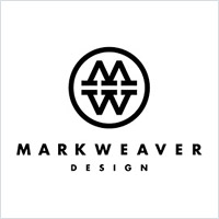
Image Credit: Mark Weaver
Mirror letters
Keep an eye out for letters that are mirror images of one another. Notice how lowercase “d” and “b” are vertical reflections of one another, while upper case “M” and “W” are horizontal reflections of one another. When letters are mirror images, you barely have to do anything to create a visual connection between them—all you really have to do is place them next to one another so that they match and highlight their similarities with the right font. You can even do this with imperfect twins like “d” and”p.”
Rotating letters
If you having trouble getting two letters to fit well together, sometimes it helps to look at them from another angle … literally.

Image Credit: Phillip Crush
Angling to touch
Try changing the angle of one or more letters to create connections they wouldn’t normally be possible. This technique can help curved letters become friends with straight letters; just be sure you don’t angle it so much that the letters look unnatural.

Image Credit: Julian Hrankov
Turning a letter upside-down
Occasionally, turning a letter upside-down can make it easier to merge or connect to another letter. Obviously, this technique will only work with characters that are still recognizable when they’re upside down. Letters that turn into an entirely different character (like W) or look exactly the same (like S) simply don’t apply.
Using symbols
Symbols can make it easier for audiences to instantly associate your lettermark with the type of business it represents. It could be an object directly related to what you do, or something more representative of the brand’s personality.

Image Credit: Arno Kathollnig
Replace letters with symbols
It seems like we’ve been using hearts to replace the letter “O” and to dot our “i’s” since the dawn of time. Depending on the brand, you might be able to ditch a letter entirely and replace it with a symbol or illustration. The important thing to remember is that readability is crucial, so the symbols and objects you use to replace a letter should still resemble the letter enough that people will understand your message.

Image Credit: Tonzer
Add symbols to the negative space
If the symbol you want to add doesn’t look like any letters that you have to use, you can try to sneak it into the negative space. This opens up a lot of creative possibilities as it allows you to make use of even the smallest of negative spaces. For example, the negative space in lower case “a” could be filled with something simple like a heart to give it some personality.
More techniques
Still need inspiration? Here are even more imaginative ways to create a two-letter logo.
Image Credit: Comedy Central
Inset letters
Depending on the size and shape of your letters, you can sometimes tuck them inside one another like Russian nesting dolls. This effect works best with a thin line, because inevitably, the outside letter is going to be bigger than the inside letter. With a thinner line, you don’t have to make the size difference too noticeable, which makes for a much more cohesive-looking lettermark.

Just barely touching
Not every letter in a ligature has to be all up on each other—it’s fine if your letters just barely touch. Generally, he more points of contact you can make and the stronger that contact is, the more solid the lettermark will be. But if you can’t do that, there’s no reason to force it. When letters have long angled arms like “K” and “X,” it can sometimes be easier to just get them to touch at the tips than to try and force contact.

Image Credit: Stellan
Interlocking
If you don’t want to crop down your letters or remove anything, you can always try weaving the letters together so that they’re connected like a chain. Don’t just put one letter over another—lock them together by going over and under. The more curves your letters have, the easier this technique will be.

Image Credit: Kara Hodecker
Handwritten
When all else fails—get out your pen and draw it out yourself. You can sometimes only go so far with existing font faces, and you might have to invent your own in order to get your ideas to come to fruition. If you’ve never created handwritten fonts before, you might be better off starting from an existing font and building onto it (or at least borrowing inspiration from it).

Image Credit: Keith Ly
Transparent overlap
Play with the opacity of your letters (especially in the sections where they overlap), to make the division between the letters more clear. When you use different colors for each letter, the areas where they overlap will create new colors, which adds a cool effect to your logo design.
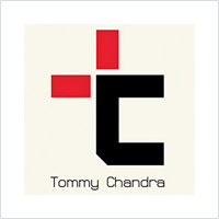
Image Credit: Toramichan
Variations in color
Sometimes one letter hides the outline of another letter within its shape. A letter P, for instance, is really just a line with a small letter D at the top. You can sometimes bring out that “hidden” letter by using a different color to accentuate it.
The only problem with this technique is that logos often need to be shown in just one color (when they’re printed in black-and-white, for example). You may want to add spaces or other elements that help each individual letter to stand out on its own, even when the logo is monochromatic.
A few tips for creating your lettermark logo
- If you’re struggling to remember what a ligature or a crossbar is, it might be time to call in the cavalry. Our professional logo services will take the pressure off and make the logo design process as simple as possible.
- Sometimes your ligatures will look like a font that is too tightly kerned, not letters that were connected deliberately. In these cases, try breaking up the kerned look by adding serifs, creating a pattern, or using colors to differentiate between the two letters.
- Be careful about creating a “new” letter when you’re combining two similar looking letters. The point of a ligature is to have individual letters that are connected while still maintaining their individuality. Hybrid letters sometimes end up looking nothing like either of the letters they’re made from. If your ligature ends up looking like something totally alien, find a way to break it up so your audience understands.
- Typeface can make the difference. Two letters that might have no easy points of connection may have an easier time connecting if you change your font. Try your ligature out in a bunch of different font combinations to get a better understanding of how the letters can visually connect. Even if you don’t end up using a font, just seeing the different variations can open you up to ideas.
- Try different combinations of techniques to create something unique and new. However, avoid overloading your lettermark with too many bells and whistles. The more alterations you put a letter through, the harder it is to read.
- Always remember that the “letter” part of the word “lettermark” is the most important. You can alter, move and change the letters all you want, but when it starts to look more like a symbol or picture, it stops being a lettermark. For example, the Toyota logo technically contains every letter in the word “Toyota,” but you would never call that a lettermark.
Share this quick-and-easy guide to lettermarks


This work by Company Folders, Inc. is licensed under a Creative Commons Attribution 4.0 International License.
Embed this graphic on your site

You should also check out our infographic about designing the perfect business logo for more helpful tips.
Do you know of other techniques or design tips for designing lettermark logos? Please share them in the comments below!


Very helpful info and ideas on creating logos with two letters.
Thanks a lot, Vladimir!
Nice Post. A perfect source of inspiration for creating two letter logo. Being a freelancer designer i always participate in various crowdsourcing platforms such as designhill, designmantic and designcrowd and shared post is a perfect source of inspiration.
Sharing vertical strokes is a great beginner technique, but I’ve seen it so much at this point it makes me want to gouge my eyes out.
Pretty impressive! Your concepts are so simple and easy to understand. Make a simple but unique logo with 2 letters that’s perfect for your business. Thanks a lot for this wonderful piece if content it can be really beneficial for beginners!