 Back when the Internet was still fairly new, the JPEG reigned as king of all image formats. Thanks to its ability to compress complex images into a low file size, JPEGS were the perfect format to use with dial-up modems and floppy disks. But nobody has used those ancient relics in years-so why does the JPEG still have such a stranglehold over us?
It’s not that JPEGs are necessarily bad or obsolete; it’s just that they’re not always the best format for the job. And these days, they’re rarely ever the right file format for print. If you or your clients are having trouble letting go of JPEGs, consider this your wake-up call.
What makes JPEGs lousy?
Most printers technically can work with JPEG, provided the image is of a high enough resolution-but it should never be your first choice for a print project.
-
JPEGs are usually too small
Most JPEGs are designed for use on the web, so they’re kept as small as possible. But that becomes a problem when you have the image professionally printed; it will end up looking tiny on paper compared to the image you see on your screen.

Your run-of-the-mill JPEG for the web is only 72 PPI (pixels per inch, sometimes referred to by the misnomer DPI), but in order to make an image look good in print at standard dimensions, it should be at least 300 PPI. You can get a high-quality print from a JPEG that’s 300 PPI or higher, but the JPEG has to have started life as a high-resolution image. You can’t convert a 72 PPI JPEG to 300 PPI and achieve quality results.
-
JPEGs sacrifice quality for low file size
No matter what the resolution of your image, there is still going to be some level of quality loss when you save it as a JPEG. This is because JPEG is a lossy compression format, which means some of the detail of your image will be lost when saved in order to keep a low file size.
Lossy compression formats make it impossible for you to recover the original data, so not only is the image altered, but the effect is irreversible. Worst of all, every time you save a JPEG, it gets compressed further and further, which can eventually lead to a downward spiral of blotchy, distorted images.
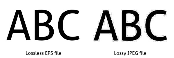
On paper, lossy compression sounds awful, but it’s actually not always noticeable. Compression on a photograph is often negligible-the biggest problems arise when you try to save vector graphics, text or anything with hard line art. In these cases, the loss of quality makes images look fuzzy and text unreadable.
-
JPEGs are hard to resize
Here’s a good way to permanently ruin your JPEG image-try resizing it.
Granted, you might be able to go smaller without much of a loss in quality (though if you go too low, you’ll lose most of your detail). But if your JPEG has line art or text, even a small drop in size can result in a blurred image.
And if you want to go bigger, forget about it. Increasing the size of your JPEG artwork without hemorrhaging quality is nigh impossible; you’ll always end up with a pixelated mess on your hands.

All this means that if working with JPEGs is a must, you have to start with the biggest possible size and work your way down to a level that’s usable without too much loss in quality. Having to use giant JPEGs is an inefficient way for designers to work-and it nullifies the biggest selling point that JPEG has going for itself. What’s the point of losing image quality in exchange for a smaller file when you end up needing a JPEG that’s as big as it can possibly be?
-
JPEGs don’t support transparency
Transparency isn’t something that print designers usually need to concern themselves with all that often-it’s typically more relevant to web design than print. However, transparency is crucial to one of the basic elements of branding: logos.
When you save a logo as a JPEG, any transparent areas of your canvas are automatically filled in with white. This can lead to issues when you try to print that logo on a dark colored background.
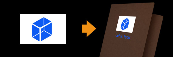
Even if you print on a white background or with white stock, you can sometimes still see the white canvas around the logo due to color error stemming from lossy compression.
JPEGs can’t handle alpha transparency either, which is why hard lines always look bad in a JPEG. When you can’t use hard lines, that eliminates most vector shapes, logos and text-practically the bread and butter of print design.
What to use instead of JPEGs?
The best answer to the question of what file format to use for your print project is whatever file format your printer prefers. In most cases, this will be something like an EPS, PSD or TIFF file.
Depending on the situation, JPEGs could still be a good file format for the web-but if you need lossless images or images with hard lines, stick to a PNG or GIF file instead. PNG will take longer to load on a website, but it’s sometimes simply worth it if it means the difference between a good or bad image.
When DO you use JPEGs?
So with all this hate toward JPEGs, you might be asking yourself why the format continues to even exist when so many better options are available.
 JPEGs are good anytime you don’t mind compensating image quality for file size, like when you want to keep the load time of your web page to a minimum. For print designers, that’s a pretty moot point since there’s no “load time” on a folder or brochure.
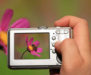
JPEG is also the standard file setting for most digital cameras. Thanks to the complexity of photographed images, a loss of image quality is often unnoticeable. The small file size of JPEG allows memory cards to hold more images. And don’t forget, the JPEGs you get from a digital camera have a higher resolution than the JPEGs you might find on a website.
What if your client is determined to use JPEGs?
As a print designer, working with JPEGs can sometimes be unavoidable-especially if your client is still clinging to the notion that JPEGs are the best option available. It’s important to make sure your client’s needs are being met, but there’s no harm in gently nudging them in the right direction, either.
Clients sometimes shy away from print-ready formats like EPS and PSD, in part because they’re larger files that take more time to open up. It’s your job to show them what lossless file formats like PNG can do that JPEG can’t.
 Start by showing them this blog post or directing them to the website NoJPEG. Talk your client through all the negative qualities that JPEGs bring to the table. You may not be able to convince every client, but you can at least open up a dialogue about their particular needs and expectations.
Conclusion
When you absolutely have to use JPEGs, make sure you keep your design files in a format that can be easily edited. Remember, the more times you save a JPEG, the more you lose from the image due to lossy compression. Never make JPEGs your working files. And always keep in mind that JPEGs for print should start out at least 300 PPI, since converting up is not an option.
What file formats do you use? Are you an adamant lover of JPEGs? Whether you’re Team JPEG or Team EPS/PNG/PSD/TIFF, leave a comment below and defend the honor of your favorite file format! We want to hear from you!

You might as well name it “Don’t print images you copied off the web.”
In fact many printers (especially in the Photography world) will specifically request level 10 jpg files. jpg files are great for printing when they are used as final output (as apposed to editing).
Most of these points don’t even relate to jpgs in particular at all.
“JPEGs are usually too small”
This has nothing to do with jpegs but is rather the filesize of the image itself. This would be true for any raster format.
“JPEGs sacrifice quality for low file size”
If you compress the bejesuz out of your image yea… don’t compress it so much. A level 10 jpg will have no visual difference to a TIFF.
“JPEGs are hard to resize”
So is any raster format.
It’s true that JPEGs can work just fine when you know what you’re doing, but a lot of novices don’t fully understand how to handle things like compression and DPI/PPI. That’s why many printers (myself included) prefer to receive native formats; they’re way more difficult to screw up.
I’ve worked in print production for 20 years. We’ve tried every format possible for color fidelity. TIFF / EPS/ BMP, you name it. Guess which format prints the most consistently?
JPEG. Yep that’s right. In our extensive tests, a high resolution JPEG in CMYK mode saved at a quality of 10 or greater produces more accurate tones, especially for digital printing. We have no idea why this is the case. It flies in the face of everything we are taught about file formats, but the proof as they say, is in the pudding.