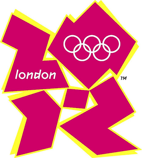
London 2012 Olympics Logo
The Olympic Games are no stranger to controversy and tragedy–and the London Olympics logo is a little bit of both. Since it was first revealed two years ago, the logo has been met with criticism for its radical design and even religious uproar when the word “zion” was thought to be hidden in the text.
The 2012 Olympics logo may be divisive, but there’s still a great deal to learn from it about the pratfalls of biting off more than you can chew when it comes to edgy design concepts.
What’s Wrong With the 2012 London Olympics Logo?
For every Olympic Games, there has been an accompanying logo that serves as a brand identity for that particular year while allowing the host country to show off under a global spotlight. A good Olympics logo should give a sense of the games themselves, while being a reflection of the time period that the games were hosted in. Most importantly, the logo should be a reflection of the host country’s culture and values.
The London Olympics logo fails in almost all of these categories. While the bright pink and yellow colors bring a sense of energy and excitement associated with the Summer Olympics, it could just as easily be an invitation to a beach party. There’s nothing in the design that specifically feels like the Olympics, other than the actual Olympic logo at the top. The design is meant to imply the year “2012,” but the elements that spell it out are so bizarrely placed and shaped that that’s not readily apparent.
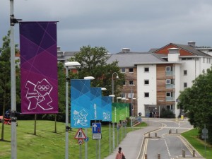
The bright colors and weird shapes of the 2012 Olympics logo do not accurately portray the host city of London.
One of the biggest complaints lobbed against this design is that it looks like something out of the 80’s or 90’s, not 2012. Granted, the 80’s and 90’s have made a kind of design comeback in pop culture, but in a strictly retro kind of way. London may be a hip, modern city, but this design gives no indication of British culture or even the London lifestyle. It could just as easily be a design for America or Japan.
The London logo caught flak in the media since the Olympics are so, well, popular. But many small brands make logo blunders that are just as bad—and just as noticeable to their customers. Our logo design services will make sure this doesn’t happen to you. Our designers will help you create a logo that speaks to your brand’s culture and history, the way these past logos did for the Olympics.
Past Olympic Logos
Mexico Summer Olympics 1968

Mexico 1968 Olympics Logo
The look of the Mexico 1968 logo is immediately reminiscent of the era itself. The Olympic Logo is worked directly into the design on the “68.” The curls in the design give you the sensation of the different lanes on a track, tying the design into the Summer Olympics. The curls are also reminiscent of a certain style of Mexican folk art, helping to tie the logo into the culture of its host country.
Calgary Winter Olympics 1988

Calgary 1988 Olympics Logo
The minimalist snowflake design for the Calgary 1988 games simultaneously makes you think of both a snowflake and a maple leaf, which is the symbol used on the Canadian flag. A number of different sized letter C’s are hidden in the design, to represent both Canada and Calgary.
Nagano Winter Olympics 1998
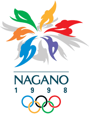
Nagano 1998 Olympics Logo
The Nagano 1998 Games had a “snowflower” design with petals that resemble human figures in various states of activity. Not only is winter and athleticism represented, but the colorful, optimistic and kinetic design is representative of the late 90’s style.
Salt Lake City Winter Olympics 2002
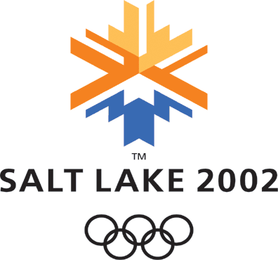
Salt Lake City 2002 Olympics Logo
The colors of the Salt Lake City 2002 logo are representative of Utah’s unique landscape and were designed to look like the sun rising over a mountain. The shape of the design has two purposes: it looks both like a snowflake and the Olympic Torch. The sans serif font and the stylized design are modern and sleek.
Turin Winter Olympics 2006
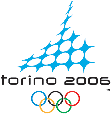
Turin 2006 Olympics Logo
The Turin 2006 logo chose to use “Torino” in the logo, which is the Italian word for the city of Turin. This is a bold way to establish brand identity. The design itself is styled after the Mole Antonelliana in Turin, but the blue grid pattern brings the feeling of winter together with a representation of modern technology and communication.
These logos are successful because the design represents the culture of the host country, the style of the era and the excitement of the Olympic Games. The London 2012 logo lacks in all three areas–it says nothing about Great Britain, it looks like a design from the 80’s and there’s nothing concrete to tie it to the athleticism or pageantry of the Olympic Games.
In the end, it might not be all bad for the London Olympics logo. The logo may not work aesthetically, but it has managed to capture our attention and will likely be remembered throughout history, albeit for the wrong reasons.


