A custom report cover has to juggle many functions at once—it must excite readers, represent your brand, market your business and accurately sum up the contents of your report. With so many factors that go into creating a report cover design, it can be frustrating trying to create a harmonious balance of catchy, creative, charismatic and cohesive elements. Unfortunately, this can often lead to overzealous design choices that do more harm than good.
Color
-

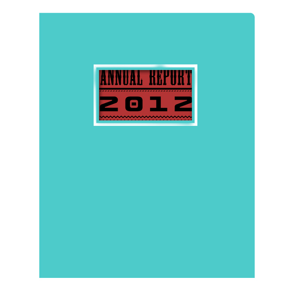
Use an attractive color scheme with a neutral color, primary color and complimentary color.
What Works
Color branding is an effective way to market your business and to make your report cover design more visually appealing. Not only do you want to pick a color that represents your brand, you want a color scheme that is agreeable.
The best way to do this is to choose a neutral tone, a main tone and a complementary tone like the design in the example.


Don’t accidentally use clashing colors or colors that are hard to see.
What Doesn’t Work
Too much of a good thing can completely ruin your design. Adding too many bright colors or colors that don’t complement one another will make your design look like an eyesore.
You always want your colors to be working towards your brand identity, whether that’s a serious business that uses dark tones or a playful business that uses lighter tones.
Texture
-

Embossing is an attractive way to add texture to your design.
What Works
Adding textural dissonance to your report cover page design makes certain elements pop out at the audience. Embossing is a common way to add texture by printing designs directly into the stock itself, creating a raised or dipped effect. In the example, we see the logo popping out at the reader through the use of embossing.
Choosing a textured paper stock is an easy way to give your cover a unique feel; you can also add texture by spot printing using different types of finishes and coatings.


Don’t use a textured stock that distorts your design.
What Doesn’t Work
If you choose to add texture using a different type of stock, you have to be careful as to which type you choose and how you design with it. You can’t faithfully reproduce a full-color picture on a textured or colored stock because the image will become distorted. Visual components on textured stocks look best with PMS inks, embossing or foil stamping.
Imagery
-

Use an appropriate image that conveys the excitement of your brand.
What Works
Your annual report cover design ideas should draw inspiration from the report itself. Think about what you’re trying to convey and the ways can you do this using an image or graphic.
In the example, we see an exciting picture meant to get investors and employees motivated for the next fiscal year. The imagery is easy to see and clear on its meaning. You want your design to be a positive representation of your company, so use positive images and optimistic design schemes.


Don’t use a picture that is confusing or has little to do with your brand.
What Doesn’t Work
Putting in a picture just for the sake of having a picture is not the right way to go. In the example, we see a picture that is completely unrelated to the company’s brand, their message and even the contents of the report itself. For the picture to work, there needs to be other components tying it back to the overall message of the design. Using too many pictures (or pictures that are distorted or unfocused) can also turn off an audience.
Message
-

A mission statement should be to-the-point and catchy.
What Works
A company slogan or mission statement can be an effective way to reach your audience while adding to the visual tapestry of your design. The best messages are clever, memorable and to the point.
In the example, we have a mission statement that tells the audience what the company is all about and gives a hint as to where they intend to be in the coming years.


A mission statement that is too long or too confusing will not help your brand.
What Doesn’t Work
Too much text can bog down your design; if the text itself isn’t catchy or creative enough to make the audience pay attention, it can ruin it completely.
In the example, the mission statement is too wordy, making it both cumbersome and boring. This statement could use some editing, both to trim it down and to make the language more engaging.
Additional Elements
-

Add-ons should be subtle and used appropriately, such as this foil stamped logo.
What Works
Subtle add-ons give your cover design a fancy look when used sparingly. In the example, the logo for the company has been foil stamped, which adds a glossy metallic effect that makes them look like an authority in their field. Consider window report covers as they create a double-cover system where the first page of the report can be seen from the outside. For added marketability, add a business card slot and a business card that matches your design.


A die-cut window is useless without anything behind it; it’s also a bad decision if it cuts off parts of your design.
What Doesn’t Work
Elements are only effective if you use them effectively – their presence in your cover design alone does not elevate it to a professional level. In the example, we see a die-cut window that obscures the design and offers nothing of real interest.
Another faux pas to avoid is an overuse of the foil stamp effect, which becomes a gaudy eyesore when used too much.
If you still find yourself lost in a sea of design possibilities, it sometimes helps to hire a designer to come up with something for you. Even if you don’t end up using the designer’s report cover ideas, you can at least see for yourself what works, what doesn’t work and how you can best represent your company.
This post is a part of our Report Covers 101 product guide.