 If four-color process printing is like mixing together flour, sugar and baking powder from scratch, PMS color printing is a little like using pre-made cake mix. You don’t have quite as much flexibility with your recipe, but it’s a great choice if you’re looking for a consistent taste because you always know exactly what you’re getting.
This guide will walk you through the definition of PMS color and its pros and cons, as well as tips and tools for finding, matching, identifying and converting PMS colors.
What is PMS Color?
PMS (which stands for Pantone Matching System) is a color system based upon over one thousand standardized ink colors. Though the system was originally developed by the Pantone corporation, it’s the standard used by many ink manufacturers throughout the country.
Unlike the CMYK color system, where cyan, magenta, yellow and black ink are mixed during the printing process, PMS inks are already mixed long before printing begins. That helps to ensure you’ll always get the color you’re expecting and minimizes variation throughout the print run.
Be aware that Pantone colors can be labeled as either coated (C) or uncoated (U). Coated inks are designed for coated paper stocks, while uncoated inks are made for uncoated stocks.
Advantages/Disadvantages of PMS Printing
The advantages of PMS printing include:
- Cost-effective option for light coverage designs containing three or fewer colors
- Rich, deep colors ideal for monochromatic designs
- Most consistent color, with no perceptible variations between printed sheets
- Best choice for printing certain colors, such as orange, grey and navy blue
- Access to unique colors, such as metallic and neon hues
- Excellent for color branding, such as matching the hue of a company logo
- Prints small text legibly, without blurry color auras
The disadvantages of PMS printing include:
- Less cost-effective for designs with four or more colors (not including tints of the same color)
- Less ideal for printing color photographs
For more information about PMS compared to other color systems, check out our blog post about the difference between RGB vs. CMYK vs. PMS color.
Tools for Browsing and Choosing PMS Colors
Pantone Color Book – Solid Coated/Uncoated Formula Guide
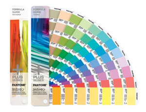 Even though you can design using Pantone colors in Photoshop, Illustrator, or InDesign, the colors on your computer monitor can vary greatly and will almost never look exactly the same as a printed PMS color, making any Pantone color chart you find online of limited use. To get the most accurate impression of how your printed PMS color will look, you should refer to a printed version of the PMS color book.
Pantone offers several publications that represent the industry standard for previewing and selecting PMS colors, the most popular being this Formula Guide, which includes 1,755 solid colors for both coated and uncoated stocks. It’s a bit of a splurge at $149, but it’s still the best choice if you want to eliminate the guesswork that comes with online PMS color charts.
Pantone Color Finder
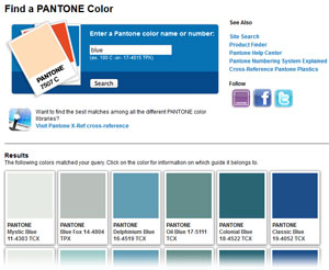 Pantone’s website features a search engine spanning every single PMS color they offer. Since you’ll be viewing them on a computer screen, this tool isn’t the ideal choice for previewing a color you intend to print. It’s very useful, however, when you already know the name or reference number of a specific color you like and want more information about it.
Simply enter the color name or number into the field and click “Search.” You’ll be able to see a sample of the color along with a listing of the Pantone color books it can be found in. You can also search for specific terms such as “blue” to see the PMS colors with names that include that term.
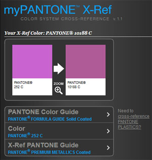 Pantone X-Ref (Cross-Reference)
Say you’ve got a standard coated PMS color you really like, and you want to use a similar color in metallic ink, neon ink, or another Pantone category. This is the tool for you.
With X-Ref, you can select a color from one Pantone color guide (such as the basic Formula Guides, the Color Bridge, Pastels & Neons, and so on) and find the color that most closely matches it in another guide.
Start by clicking “PANTONE Color Guide” and selecting the book that contains the color you’re referencing. Then, click “Color” to browse the colors in that book and select the color in question. Finally, click “X-Ref PANTONE Guide” and select the book in which you want to find a matching color.
Matching PMS Colors to an Image, Logo or Surface
 Want your PMS design to match an existing printed design, a piece of storefront branding, or even your product itself?
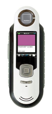
You could use the Pantone formula guide to match them by eye, but if you’ve got some extra money in your design budget, consider using Capsure. This is a hand-held tool that allows you to sample a color from virtually any surface you desire and instantly match it to the closest available PMS colors.
Just know that Capsure comes with a hefty $649 price tag. If you can get by without the extra convenience, you may want to make do with a normal printed Pantone color book.
If you want to match your color to a digital image (such as a website or digital photograph), the easy-to-use web tool Pick Color from Image can help you out.
To use it, just click Browse, select the image with the color you want to match, and then click Upload. Your image will be displayed on the page. Now, just click the spot on the image with the color you want to match (such as a website’s background, an employee’s T-shirt, or a piece of text). The tool will then display the PMS colors that most closely match it.
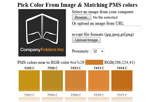
Keep in mind that digital images use the RGB color system, so you’ll never get a perfectly accurate PMS match—but you can get a close approximation. If you want a truly accurate color match, stick with Pantone’s color book or Capsure.
Identifying the PMS Colors in Your Design
When requesting a quote or ordering a custom folder from Company Folders, you’ll be asked to provide a number for each PMS color in the design you intend to print. Here’s how to obtain those numbers so that you can add them to the necessary forms.
Use this section only if your artwork has already been designed with Pantone colors. If you’ve created a CMYK design that you want to print with PMS, you’ll need to convert to PMS colors first.
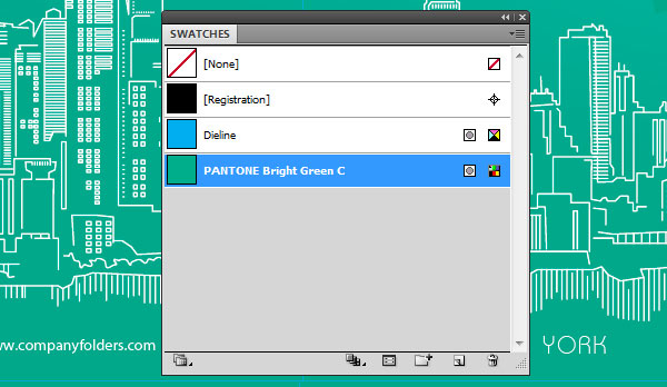
Illustrator
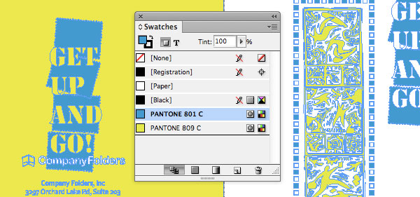
If it isn’t already open, open the Swatches window by clicking Window and then Swatches. Each Pantone color in the design will be labeled with PANTONE followed by the PMS name or reference number (such as 801 U or Bright Green C).
InDesign
This is essentially the same process as with Illustrator. Open the Swatches panel by clicking Window > Color > Swatches. Each Pantone color in the design will be labeled with PANTONE followed by the PMS reference number.
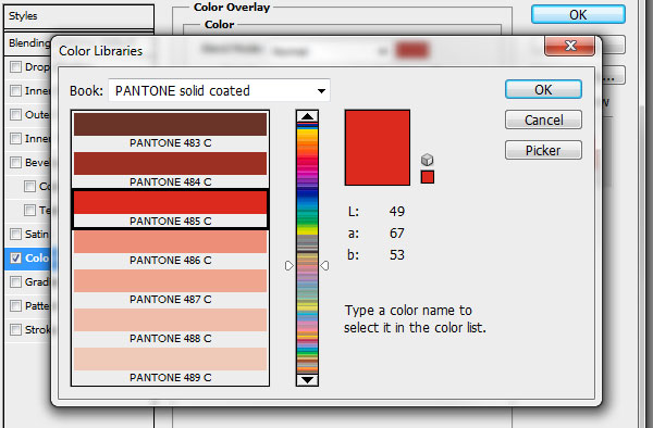
Photoshop
Double-click a layer consisting of PMS color elements. Click Color Overlay and then click the colored square next to “Blend Mode.” If the layer in question is set to a PMS color overlay, you will see the name or number for that color highlighted in this window.
Converting to PMS Colors
It’s best to create a design that you intend to print with PMS ink using Pantone colors from the very beginning, but if you’ve already created artwork with RGB or CMYK colors, you might be able to turn it into a PMS design without too much hassle.
This Pantone conversion tutorial from TutsPlus demonstrates a quick and easy way to convert to PMS in Illustrator.
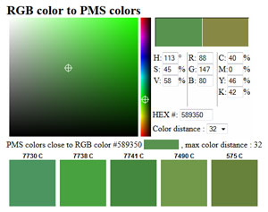 Alternatively, you can use this RGB/CMYK to PMS web tool to instantly view the names of the PMS colors that most closely resemble an RGB, CMYK, or hexadecimal color.
Just input the individual color values for your color of choice. You can enter red/green/blue or cyan/magenta/yellow/black. You can also enter HSV (hue, saturation and value) numbers or the hex code of a color you might use on a website. Any close-matching PMS colors will be displayed automatically.
This is also a handy tool if you’re building a design from scratch and want to match the RGB or CMYK colors in another design as nearly as possible.
Conclusion
PMS color printing can result in some truly spectacular works of art. Similar to writing a haiku, it’s all about understanding the nuances and limitations of your medium; working within those limits can actually help spark your creativity.
Do you have more questions about designing and printing with PMS colors? Got a PMS design you want to show off? Feel free to leave a comment below!

I have to comment because this was a truly useful read. I have been researching this topic for quite sometime now, and havent found anything anywhere near as helpful.
I do have a couple questions however:
1. When your client is asking for their colour values, but you dont know what material they will be printing on, what is best to give them?
2. Its easy to get the CMYK colour values of a tone you’re using within a design on your computer, however, when you print that, it may look very different than your screen. If your client is asking for the CMYK values of their icons colour, are these the values they are asking for?
1. Not sure I understand what you mean by “color values.” Do you mean the CMYK/Pantone reference numbers corresponding to a particular hue?
2. When you’re talking about a digital image on a screen, CMYK values are more of an approximation; you can’t convert directly from RGB to CMYK without at least a minor change in hue. Not all clients will understand that, so if they ask for the CMYK value of a digital image, make it clear that although you can get a close approximation, the color won’t be exactly the same.
This blog post might help: https://www.companyfolders.com/blog/rgb-vs-cmyk-vs-pms-deciphering-designs-confusing-color-jargon
Great article. I work in the custom lapel pin industry and while we don’t print to make the pins we do use coated pms values to identify colors. The tool will be very helpful to give to customers to help them identify what color they need. I do have a question though. I tried just uploading a simple pin design, one color only. It came back with 7 or 8 color references yet there was only one color in the artwork. Why does it do this? Is there something I’m missing that would have the tool return only one value?
Since it’s rare to find an exact PMS color match to a CMYK color, the tool will pick out a few colors that match it as closely as possible. The lowest proximity setting is 32; setting that number higher will expand the results to even more colors. The only way I know of to make this particular tool return only one color is if you happen to select a color in the image that only has a single closely matching PMS color.
This post has given me a good understanding of the color processes – thank you. We’re in the process of printing our flag on material but the metallic gold PMS approved color is much darker and more of an olive tone. We’re told that printing on fabric and keeping the color true to the logo approved PMS colors is nearly impossible. Can you help? What should we be doing to ensure a close if not an exact match? With gratitude –
When printing on fabric, light colors may not show up on a darker background if you do not first apply an underbase layer. Think of the underbase layer as a primer before painting; it prepares the canvas (or in this case, the fabric) to accept the application of color. You may also want to check that you’re using the best print method for the type of fabric you’ve chosen.