A logo is more than just a pretty image for customers to look at while they use a product or service. It’s the face of an entire brand, a symbol that determines how people feel about that particular company. For example, if a restaurant’s logo is cold and unappetizing, potential customers are going to associate that image with their food.
So what sort of ingredients do you need to cook up a tasty, irresistible logo? This infographic will provide you with tips and ideas related to each of the qualities that a successful logo design must have.
![]()

This work by Company Folders, Inc. is licensed under a Creative Commons Attribution 4.0 International License.
Embed this on your site
Download segment images
Want to use a certain section of our infographic in a blog post or educational presentation? Download the individual segments of the graphic here.
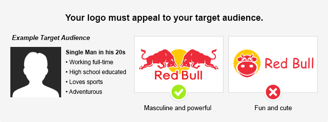
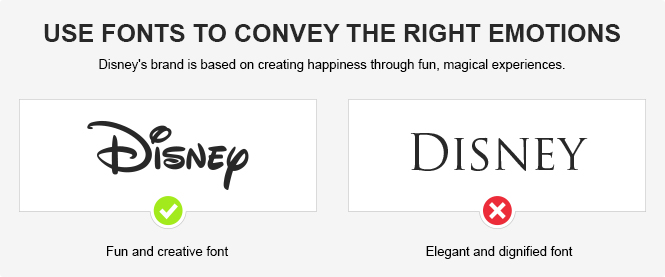
Be Enticing - An example of how to design a logo with your audience's interests and background in mind.
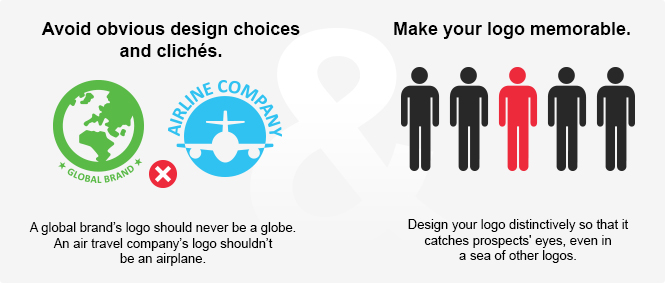
Be Unique - Illustrates the need for logos to be memorable and avoid obvious clichés.
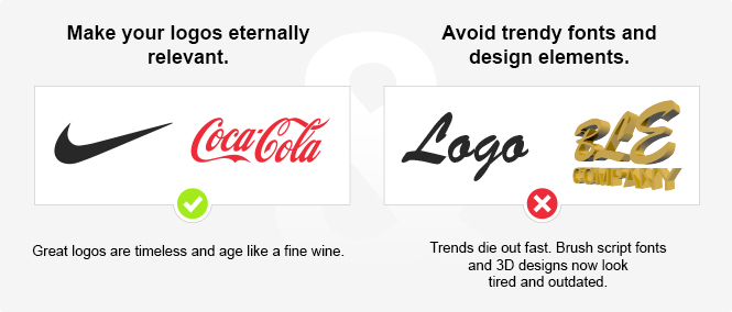
Be Timeless - Urges the viewer to avoid short-lived design fads and create timeless, resilient logos.
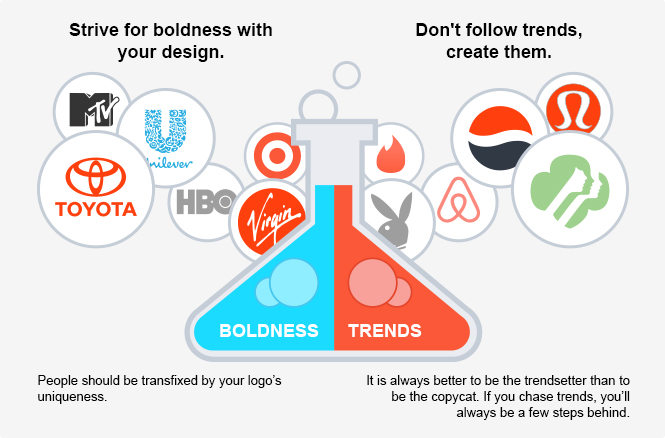
Be New - Encourages designers to be bold and create trends, not follow them.
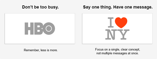
Be Simple - Advocates for clean, effortless logo design that focuses on a single message.
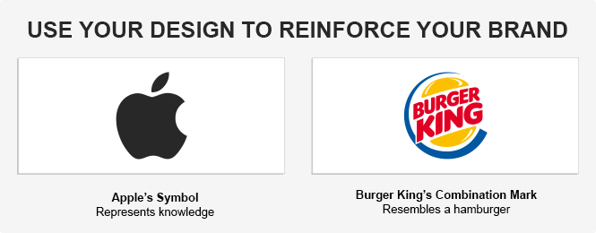
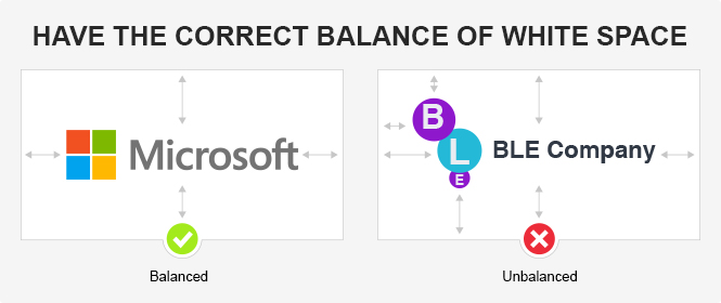
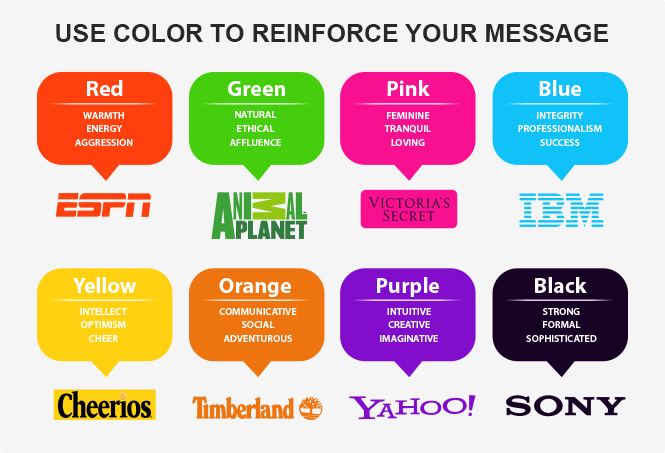
Be Consistent - Several images detailing the need for all elements of a design to reinforce your brand.
![]()
![]()
![]()

![]()
![]()
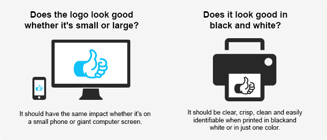
Be Adaptable - Shows how a logo must be versatile enough to fit multiple sizes and color formats.
For more information about how to design a great business logo, check out the following resources:
- Logo Design Services – Our expert team of graphic designers will work with you to create a logo that’s just right for your brand.
- The 5 Different Logo Design Styles: Which Type Fits Your Brand? – A rundown of the five basic categories of logos and their individual strengths and weaknesses.
- Logo Design: 60 Pro Tips – A collection of helpful, easy-to-understand logo design advice.
- Logo Design: Shapes and Symbols – A LinkedIn Learning video course detailing the elements of an awesome logo.
- What makes a good logo? – Prolific graphic designer David Airey (author of Logo Design Love) shares valuable advice for creating logos.
- How to Create a Logo – An eloquent summary of the considerations that logo designers should keep in mind.
- 10 Logo Design Tips for a Timeless and Creative Logo – Learn what to do (and what not to do) to make a lasting logo that stands out.
- Are Your Web Graphics Print-Ready? – Includes tips for designing a logo that looks great both in print and on the web.
- The Psychology of Logo Design – Understand the hidden meanings and implications of your design with this thoughtful article.
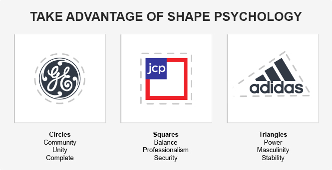
- The Psychology of Logo Shapes: A Designer’s Guide – Learn how the shapes in your logo can affect the viewer’s emotional response.
Do you have other helpful design tips or resources for creating an ideal logo design? Please share your thoughts in the comments below!
Thanks for Downloading!
To get more access to exclusive content, follow us on:


The Disney font wasn’t chosen because it was “fun and creative”; it’s based on the actual signature of Walt Disney.
That’s not exactly true. The signature used in the Disney logo actually came from one of his employees. (broken link removed)
But regardless, I would argue that the font’s resemblance to a signature (even if it’s not Disney’s) is what makes it fun and creative, and that choice wasn’t made arbitrarily. Signatures denote personal authorship and creativity; rounded, “swirly” typefaces are more likely to indicate fun and frivolity.
It’s interesting how the target demographic affects the logo design. Your first example comparing the masculine logo with the cute one illustrates this concept. Thanks for the great info-graphic, it is sure to help with my logo design.
Awesome work with the research and infographic design(of course). According to my experience, keeping the Logos simple and not opting for too much details resulted in a close to perfect Logo design.
Daniel Shane, Senior Graphic designer – Logo orbit
Vladimir,
Thank you for posting this infographic. I think this infographic will give many informations especially for student of graphic design, how to create a good logo from the expert through infographic. This infographic shows the details very well.
Kind Regards
akbar-rhadit
One of the main goals of a logo is recognition and a lasting impression. You want people to immediately recognize it and become familiar with your company. Another important rule to keep in mind is that you may need to change up your style based on your target audience.
This is a great resource! I am a high school graphic design teacher and am developing resources for the state. Would I be able to use this infograph? Possibly break it up into slides for a presentation? If so, how would you like to be credited?
Glad we can help you out! Feel free to use it as a learning tool for your students. Please credit Company Folders, and if it’s going to be online, it would be great if you could include a link so others can find it too.
I’m developing a course for Georgia Virtual School on Entrepreneurship. This infographic is perfect to teach students about logo design. I see that you have a CC Attribution license, I’d like to use the entire infographic, not just sections. I see I can download sections, but I don’t see where I can download the entire infographic. Is it possible for me to do this? I would attribute to your company and I’ll provide a link if possible. The information would only be available to our students.
Thank you.
Hello,
You should be able to right-click the graphic and select “Save as” or similar option, depending on your browser. I hope that helps.
sorry, I wanna ask, is it a logo that determined the brand position of any product, or the brand of product that determined the logo in bussiness?
Hey Vladimir,
I really enjoyed reviewing this infographic as it highlighted the real blend of a perfect and unique logo design creation. Creative designing is definitely an art, but you need to use your common sense and should not overlook the minor things.
Thanks
Great tips! Using your imagination on logo designs can be interesting! No two minds are alike. A persons talent may be in their designed logo that creates a memorable idea that pushes your product for your business. Thanks for sharing!
My graphic design prof showed us this once in a lecture and it’s stuck with me ever since. Great resource!
Simple yet, executable & actionable steps to understand & create a business logo. A well planned article for logo design lovers like us.
Extraordinary tips! Utilizing your creative mind on logo plans can be intriguing! No two personalities are indistinguishable. A people ability might be in their planned logo that makes an important thought that promotes your item for your business. A debt of gratitude is in order for sharing!
Wordmarks and letter marks are logos with details. The worst font is the one you can’t read. Its simplicity is all the more impressive since it contains nuance and meaning. Creating unique, interesting things can be fun and exciting.