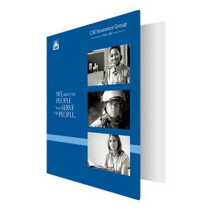
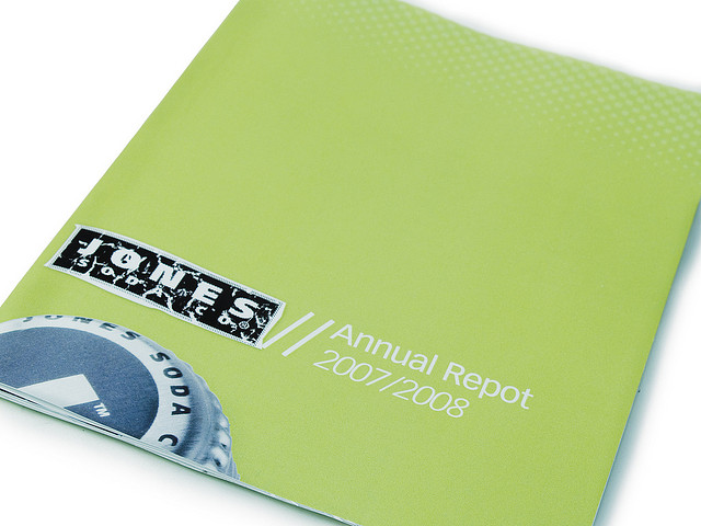
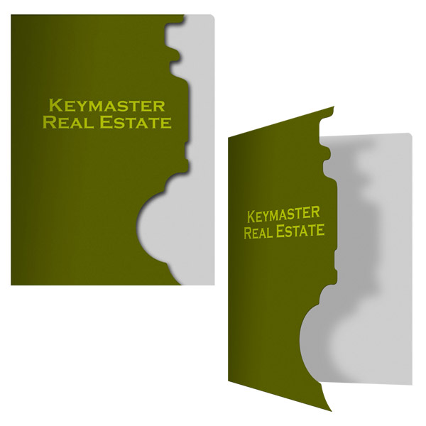
A picture is worth a thousand words – so using the right pictures on your custom binders can add an abundance of information to your design without making it cluttered. Humans retain images better than we retain words or things that we’ve heard; therefore, it’s crucial to have some sort of visual element in your binder design if you want to make an impact.
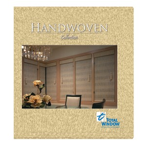
The front cover is obviously a popular spot to place images – but don’t overlook other areas.
Placement Matters
Pictures can go anywhere on a binder that you think a visual touch is needed. The front and back covers are the most popular choices, but don’t forget about the interior or on the pockets. Pictures can also be added to your tabbed dividers to add visuals to your information. When selecting the location of your image, consider how the binder will be used and how people will hold it in their hands, and plan accordingly to make the image noticeable.
Make One Big Statement
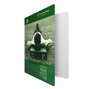
If you have a high quality photo that you think deserves center spotlight, then by all means put it front and center. Sometimes one big central image is all you need to make a statement. Make sure it’s eye catching enough to grab your audience’s attention and that the image has a high resolution rate. The image should say something about your company, its goals or your product to make your message come across in the design.
Go Small for Subtle Effects
For whatever reason, you may find that a big picture won’t work for your company’s needs and that something more subtle would have a better effect. Try incorporating an image into your company logo too add some visual punch. Simplify designs and go for stylization over realism to create a truly memorable look. For example, rather than a stock picture of an accountant, a CPA binder might use a series of bars and dots to create a stylized abacus design.
Create a Sequence
Placing multiple pictures on custom binders can also be an effective way to create incredibly cool binders. Choose a series of two to four images that best captures the message you want to convey. This gives you the chance to visually represent the many different aspects of your business, like in the example to the right which shows pictures of different types of customers. Sequences also let you play with timing and tell a story in your design. For example, a binder for a bar might have a mug of beer on the cover and an empty mug on the back.
An example of how PMS spot printing binders can create a more vibrant, richer color tone when using just a few colors.
Ink and Printing Options
Four color or CMYK printing is recommended if you want images to retain their natural colors. However, you can also pull off a successful binder design using PMS printing. This process uses pre-mixed inks to create a much richer color that is truer to the actual tone – however, you can only use a few colors at once.
Reverse printing is a unique way to display an image by having ink cover the entire binder, except for select areas which are left the natural color of the stock. This creates a natural but noticeable effect that’s especially useful when you want white text or pictures.
Foil Accents
Foil stamping adds a shiny, metallic surface to your binder design. It does not have the same tonal variations as ink, works best for simple shapes and outline, and a foil logo on a leather binder looks great. However, you can add foil accents to your pictures to accentuate different features. For example, this design has a picture of a car with the metal grill of the car foil stamped to look more metallic.
Stand out with Embossing
If you really like an image, use embossing techniques to make it stand out. “Blind embossing” can be used in place of ink to stamp an image directly into your binder – however, this causes the picture to become more subtle. Alternatively, try printing a full color picture and using embossing the make all or part of it literally leap off the page. This adds an element of texture and allows you to place tactile emphasis on certain aspects of your design.
The quality of the images you use in your custom binders will have a direct impact on their effectiveness. Stock photography doesn’t impress as much as custom-made pictures, so consider taking the extra effort to hire a professional photographer and come up with your own unique photos.
This post is a part of our Binders 101 product guide.

