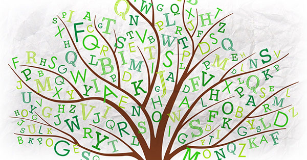
A 14-year old boy recently made headlines when he claimed the government could save millions of dollars every year if they switched to using the font Garamond in all of their printed materials. While his claim was not exactly accurate, it did bring attention to an often neglected issue—the fact that some fonts require more ink than other fonts, which is bad news for the environment.
If you’re concerned about creating unnecessary waste and utilizing green business practices, then you should know that choosing ink-saving “eco fonts” at the start of your project can help make a much more environmentally-friendly folder.
Why switch to an ink-saving font?

Photo Credit: Alex Vye
More ink usage means a longer print job, which uses more electricity. When a printer has to order more ink, it has to be manufactured and shipped, while the discarded ink containers create plastic and metal waste. All of this has the side effect of creating more CO2 emissions and increasing your carbon footprint.
When a design uses less ink, it also means that if the final product is eventually recycled, the plant won’t have to use as much energy stripping ink from the paper. Additionally, less bleaching will be necessary, which means fewer harmful chemicals will end up impacting the environment.
Choosing an eco font
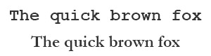
When it comes to choosing fonts that save ink, size matters. The smaller the surface area of the font, the less ink it requires to print. For example, everybody’s favorite default font, Times New Roman, is pretty economical thanks to the thin letters. Look for terms like Thin, Condensed or Narrow, as they usually indicate that the font has been designed to use less ink.
Another rule of thumb is to choose fonts that are sans serif, as those little flourishes can add up to a lot of extra ink usage. Note that the “sans” rule isn’t a hard and fast rule—Times New Roman has serifs, but it’s still more eco-friendly than some sans serif fonts out there.
Above all, keep your font readable. Otherwise, your materials are likely to be thrown away without consideration, which means that all of that ink you might have saved from printing with an eco-friendly font was for naught.
If you need a place to start, here’s a list of some of the best ink-saving fonts that you might want to consider.
-
1. Ryman Eco
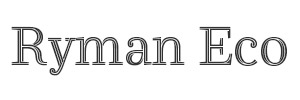 Ryman Stationery, an office supply chain store in the UK, has created what they call “the world’s most beautiful sustainable font.” Ryman Eco is a free font that uses 33% less ink than standard fonts and looks gorgeous doing it.
The letters in Ryman Eco are hollow with very thin lines, but when printed at a small enough size, the audience is none the wiser because the ink bleeds together. At larger sizes, the hollow letters are more apparent, but the look is actually quite interesting and may help to engage your audience.
-
2. Ecofont Sans
 Ryman Stationary isn’t the only game in town when it comes to eco-friendly font options. A company called Ecofont is dedicated to helping people use less ink when they print text. Their signature font, Ecofont Sans, has tiny holes poked into the letters to use less ink. Again, at smaller sizes, the holes are negligible due to ink bleed.
Ecofont isn’t just a font face; it’s also software that can help you poke tiny holes in the standard fonts you typically use, such as Arial, Calibri, Verdana, Times New Roman and Trebuchet MS. Using the Ecofont software, you can reduce your ink usage by up to 50%. Be aware, however, that neither the software nor the Ecofont Sans font are free.
-
3. Courier
 A much more reader-friendly option than Garamond, the standard font Courier uses letters that are thin but not small, which means you won’t have to make your text any larger than normal to make it legible.
Courier has a retro typewriter style that might not work for every design scheme, but that’s exactly what makes it so economical—it was designed for typewriters, which means it was designed to save on ink.
-
4. Century Gothic
 Again, thanks to the early days of print, we have ink-saving fonts like Century Gothic that are designed with thin letters for maximum readability and minimal ink usage. Century Gothic is also a sans serif font, so it saves more ink by staying simple.
There is a downside to Century Gothic, however; it’s wider than most fonts, so it takes up more room on the page. Depending on how much you need to use it in your print design, this could mean needing more paper than usual.
-
5. Brush Script
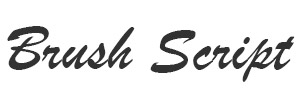 As you might recall, we’re not the biggest fans of Brush Script. But strangely enough, it actually uses less ink than Times New Roman, even with all the fancy add-ons and curlicues. It’s not our favorite (and it’s not especially readable), but it could make for an eco-friendly alternative for a headline or logo font since it saves more ink than your standard bold fonts.
The key is finding a balance between clean, legible design and eco-friendliness. If you absolutely have to use big, fat, ink-draining fonts because your design aesthetic requires it, find other ways to offset the cost to the environment, such as switching to a recycled stock.
Other ways to save on ink usage
Unfortunately, sometimes an ink-saving font just isn’t an option if it doesn’t mesh with your design. But there are other ways to reduce the amount of ink you utilize when printing text.
Garamond is a physically smaller font, so it does technically use less ink than other fonts, but at the cost of readability.
- Reducing the size of your fonts can go a long way—after all, the only reason people point to Garamond as the ultimate eco-friendly font is because it’s a naturally smaller font. In other words, text written in 12-point Garamond will be physically smaller than text written in most other 12-point fonts. It technically uses less ink, but it’s also less readable. You’re better off just reducing the size of your text and using fonts and techniques that maximize readability at small sizes.
- Bold text requires a greater amount of ink coverage than normal text, so go easy on it. If you need to bring attention to something in the body text, consider using italics instead.
- Consider using fewer printed elements altogether. Try using blind embossing; not only will it give your project a sophisticated look, it uses absolutely no ink. Keep any printed text as concise as possible to cut back on ink usage. For example, don’t use full paragraphs to say something if you can deliver the same information in a bulleted list.
Make a difference
As a print designer, you can’t always make eco-friendly choices for your clients; sometimes they’re just going to want something extravagant that uses up a lot of resources. But if you do something as simple as suggest the use of an ink-saving font, you can at least make a small difference. And the more print designers out there who make small differences, the more it all adds up to something bigger.
Which fonts are your favorites when you want to be economical with your ink usage? Can you think of other choices that graphic artists can make to help reduce the carbon footprint of their print designs? Leave your comments below, and let’s brainstorm some ideas about how print designers can save the world!


Can I have a better understanding on this eco-font software, the print-out is only for printers and copier printing? How about newspaper web offset printing via CTP and then get printed on the press — does it work too? And the bulk of text are from editorial newsroom and our completed page prints to a RIP and then to plates and then to print on the press. Where do we install the licence (on individual PC or on the Rips during rasterizing of separations). Tks.
This is a great question. Most likely, you would install the license on the individual computers. However, I would recommend contacting Ecofont support to verify this and to learn more about this ink-saving software.
Hello Vladimir,
With regards to ink save, how much ink could be saved if I change to Garamond or century Gothic compared to Times New Roman? A normal cartridge might be used to print 240 pages using Times New Roman or Arial..So by using Garamond or century gothic how many pages can be printed?