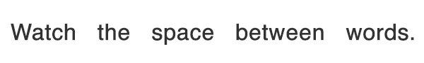
We all have those things that just make us cringe with agony. Nails on a chalkboard, aluminum foil touching your fillings—or if you’re a print designer, bad kerning mistakes.
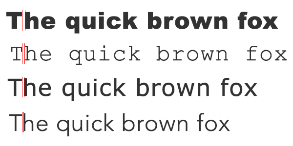
When letters are improperly spaced, it can ruin the look of your design. The worst kerning is usually the result of not kerning at all, trusting that the typographer and your graphic design software both know what they’re doing. A lot of times you get lucky—but there’s no reason to leave the success of your design up to chance.
Take the time to properly kern your fonts. It’s not that hard, and it’ll always make the difference. We’ll show you how with these 13 easy tips and techniques.
1. Know which font you’re using ahead of time
Different fonts call for different levels of kerning.
It should go without saying that you can’t kern your fonts unless you actually have fonts to kern in the first place. You should try as much as possible to have your final selection of fonts ready to go before you start the kerning process. And you should try to pick fonts that already have good kerning to save you some work; there’s only so much you can do with an ugly font.
Every font is different, so the kerning you apply to one font can’t necessarily be mixed-and-matched with another one. Fonts can also change personalities depending on what other fonts they’re paired with. You might have a perfectly kerned font for your headline text, but change the font for your subtitle, and suddenly that perfectly kerned headline no longer looks so perfect. That’s why it’s important to plan out all of the fonts your design will include.
2. Start with leading and tracking
![]()
Making changes to your font’s leading and tracking can impact the way that readers will perceive the space between your letters, so you’ll need to take care of those before you begin kerning. Taking care of these two steps first will make the kerning process much easier.
Leading refers to the vertical spacing between two lines. Remember back in school when you used to pad out your papers by “double-spacing” them? Congratulations—you already know how to use leading to your advantage.
Tracking is kind of like kerning on a massive scale; it refers to the uniform space between all of the letters in your piece. So if you already know that you want the overall kerning to be loose or tight, you can play with the tracking to rough out how the final product will look. Keep in mind that equally measured distances don’t always look right, so once you start actually kerning, you’ll probably undo many of the changes you made to the tracking.
3. Accept that you’ll have to kern each letter individually

Plenty of design programs have automatic kerning settings, such as the optical settings for InDesign, Illustrator and Photoshop. However, you shouldn’t always rely on your design software to do the work for you because kerning is more about how the human eye is going to perceive the space between the letters. Our current technology just can’t compete with your own two eyes.
Accept the fact that you’re going to need to take a hands-on approach to kerning and tackle it on a letter-by-letter basis. It’s still the best practice, and it’s the only way that you can ensure that your letters will look evenly spaced. Yes, it’s a time consuming process and the quicker you rush it, the more likely you are to botch it.
Slow down, accept your fate and understand that it gets quicker with experience. Sometimes you won’t have to move anything at all, but you won’t know for sure until you take a closer look.
4. Kerning is about visual space, not actual space
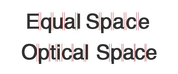
What sets kerning apart from tracking is the fact that kerning is based on visual distance, not perfectly equal measurements. The point of kerning is to make everything look evenly spaced—but that doesn’t always mean the letters are actually spaced out evenly. Sometimes putting the exact same amount of space between all of your letters actually creates an unequal look.
Kerning is all about the eye. Case in point—kerning originates from old printing presses, when each individual letter had to be placed by hand using wooden blocks. Printers in those days found that placing a perfectly equal amount of space between each letter (a.k.a. mechanical spacing) could actually make them appear unbalanced.
Instead, they had to invent special notched blocks that would allow certain letters to be closer to one another, so that the perceived space between them would look equal even if it wasn’t the case. Letters carry different visual weight, which is why optical spacing is what really counts.
5. Use straight and curved letters as measuring tools
Since kerning relies on trusting your eye instead of a unit of measurement, you have to learn to train your eye to look for the right amount of spacing. One way to do this is to establish a visual standard through the space between straight and curved letters.
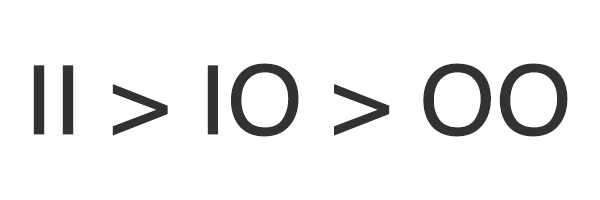
You can easily see the distance between two letters with straight lines (such as “II,” as in the first two letters in “Illinois”). The combination of “II” even looks like two notches on a ruler. There tends to be quite a bit of space between letters with straight, vertical strokes.
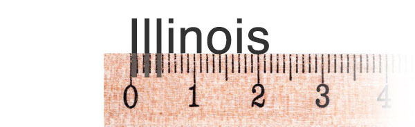
Meanwhile, curved letters stick out some, so our eyes see them as being bigger than they actually are. The curves almost seem to invade one another’s space. Readers will perceive a combination of a straight and curved letter (like “IO”) as having less space between them, while a pair of curved letters like “OO” will have even less.
With these three units of visual measurement, you can start to get an understanding of how letters look when paired with one another and use this to your advantage. Written as an equation, it would look something like this:
6. Certain letters can be tricky

If letters were made up of only horizontal, vertical and perfectly curved lines, then kerning could be done with an algorithm. The robot print designers of the future will probably have no problem kerning their binary typography. But we humans also have weird diagonal and strange-shaped letters in our alphabet, which can be a problem.
There are no hard and fast rules for problematic letters like AKVWYTL, so you just have to watch out for these letters and try your best to make the perceived space between them work. These kinds of letters create a lot of negative space, which the eye can sometimes mistake for bad kerning.
These are the kinds of letters that can allow your creativity to come out and play. For example, consider the FedEx logo, which takes advantage of the negative space caused by that problematic “X,” turning it into a hidden arrow.

But you can’t always use techniques like these, especially when you’re kerning body text or other text that requires readability over creativity. Pay special attention to letters that create large negative space, but don’t rely on them to set the kerning for the rest of the word.
7. Kern whenever you change font sizes
Every time your font changes size, you’re going to have to go back to the kerning board, so to speak. Kerning only concerns itself with the perceived space between letters and that perception changes whenever you alter the size of your font.
That’s because the fonts themselves either become heavier or lighter, depending on whether you’ve increased or decreased the size. Of course, the relative space between the letters hasn’t changed, but it’s never about the hard numbers in kerning—it’s all about the feels.
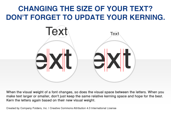
Consider having multiple versions of different typographical elements, each properly kerned for different sizes. For example, you might have large and small versions of your logo that look identical to the naked eye—but only because you spent the time kerning both logos individually.
8. Take it three letters at a time
The idea of kerning every single letter can be a bit overwhelming. It causes a lot of designers to phone it in and cheat, giving their designs a general look-over instead of the individual attention it needs. To make it easier to put in the work it takes to kern your typography, try taking it three letters at a time.
Focus on the spacing of the first three letters in a word and ignore the rest. Once the first three letters are spaced, move over to the next three.
And by “next three,” we mean the next three in succession. A six letter word like “folder” is going to be broken down four different ways—not two.

Keep kerning three letters at a time until you reach the end of the word. When you’re finished, the entire word should look evenly spaced.
9. Change the way you look at the letters
Letters are just visual symbols, but we often have a hard time looking at them strictly as design elements instead of the words and sounds they represent. Sometimes kerning is easier if you change the way you look at the letters and try to sever that connection between the symbol and the meaning behind it.
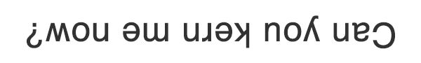
One trick to doing this is to flip the word upside down. This forces you to look at the letters strictly as visual symbols divorced from their meaning, which can make it easier to spot spacing problems.
Another tip is to blur the letters so that they resemble vague blobs instead of actual letters. This is a great way to understand the “color” that typography can cast over your design by seeing which areas are darker-colored and which ones are lighter. You don’t even need to alter the letters themselves to do this—try squinting or even just viewing the letters from the other side of the room.
10. Surround tricky combinations with straight and curved neighbors
As we’ve already established, combinations of straight and curved letters can be used as a sort of measuring tool to figure out how much space to place between them. When you’re faced with a difficult combination of letters to kern (such as YA, which involves diagonal strokes at different angles), you can fall back on the letters that you know in order to better measure out the ones you’re not sure of.
Surround the tricky combination with all straight letters, curved letters and a combination of both. For example:
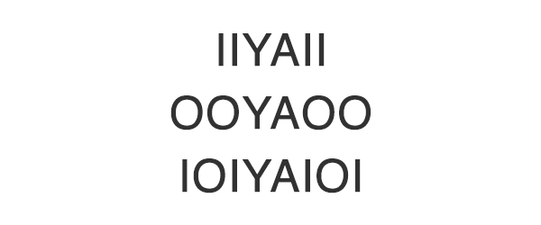
Surrounding characters with different combinations of ‘I’ and ‘O’ can make them easier to kern.
It’s a little like surrounding it with a handy ruler—but of course, an actual ruler would be useless in this situation because kerning is all about perceived spacing. Since you can understand the perceived space between straight letters, curved letters and a combination of both, you can apply those perceptions onto the space between your difficult letters like YA.
11. Let your letters breathe

Just because we told you to take kerning one letter at a time doesn’t mean that you should kern your text so much that your design becomes too tight. It’s important that you give this step the time and care that it needs, but the general rule of kerning is that “less is more.”
When your kerning is too tight, it makes it hard for the audience to read as eye fatigue sets in. Let your letters breathe a little. They should be tight enough to form coherent words, but loose enough so that each letter can be individually identified.
This is especially true in print design, where tight kerning can lead to printing errors such as ink bleed. You’ll need to compensate for the fact that your kerning will naturally tighten during the printing process due to the application of ink.
12. Look at word spacing, too
Kerning isn’t just about the space between letters—you also have to pay some attention to the spacing between words. Each word needs to be spaced enough to stand out on its own, but also close enough together that the audience can see the natural flow of the sentence.
Playing with the space between words will also have an effect on the perceived space between your letters. Sometimes if the space between words is too big, it’ll make the words themselves look too tightly kerned. The same thing happens in reverse when the words are too tightly packed, it’ll look like the kerning on each word is too loose.
Every now and then you might find yourself having to tweak the spacing between two words, but for the most part you can set a uniform amount of space between each word. The rest you can fix as you kern on a letter by letter basis.
13. Practice makes perfect (and have fun while you do it)
Kerning requires experience because you have to gain an eye for it, so the more you take the time to kern your letters, the better you’ll get at it. If you want to practice, you can always grab some randomly generated words from a lorem ipsum generator and try to kern your favorite fonts.
If you want to actually have some fun while you practice kerning, try the Kern Me game. Not only does it give you a hands-on demonstration of the principles of kerning, it’s also a great way to track your progress to see how that ol’ eye for kerning is coming along.
We recommend playing the Kern Me game before every kerning session as a sort of warm-up exercise. You can complete the entire game in a few minutes, and it helps you keep those brain muscles working and thinking about kerning. Consider it like a good stretch before a workout.
Goodbye, bad kerning
If we all take the time to get better at kerning, one day all those hilarious errors you find in places like the kerning subreddit will be ancient artifacts. Bad kerning will become a thing of the past. It’ll be this design dinosaur we tell our designer grandchildren about. So let’s take the time to appreciate bad kerning while we still have it in our lives.
Got any examples of truly bad kerning? Post a comment here and we can preserve this phenomenon for future generations.


Great information about the fonts. I never thought of thinking about these tiny details while designing a font. Thanks for sharing.
Hello Vladimir, do you have specific tips on kerning on-screen texts? Even with todays high resolution displays, letters still seem to be somewhat more ‘restless’ on screen in comparison with printed material. Is there a fundamental cause or are most fonts optimized for printing and does that hamper there on-screen rendering? Could you shed some light on this subject? Maybe even the lighting is part of the problem …
Adobe applications provide different Composition Preferences that can change the way text displays in order to calculate line breaks and reduce hyphenation (if enabled). Depending on the Composition Preference chosen, you might see a difference in how things kern or track. Also, spacing is always limited to the pixel resolution grid when displaying onscreen. Objects will break to display at the pixel width, which could affect the fine details of typography. An object can not display half on one pixel and half on another. It falls to one side or the other onscreen but prints precisely because the printer resolution is much higher and is able to render more accurately. This is likely the issue.