 Nobody wants to be the one person to miss out on the latest trends, but keeping up with fads isn’t always an indication of quality. If it were, people would still be dancing the Macarena and playing pogs. Likewise, many of the popular print design trends of the past just end up making artwork look dated and unprofessional by modern standards.
But not every printing trend is a relic from the Clinton era. Some are relatively new fads that are so widespread and standard that nobody really stops to wonder if they’re really a good idea. Here are 13 tacky print design trends that we dearly wish would disappear altogether.
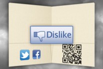
1. Social icons on the printed page
Social media icons work great on the Web. They’re small and simple, so you can plop them down into any website or blog post; they’re also styled like desktop icons to indicate that audiences can click them to go straight to your social media profile.
But until they make paper clickable, adding social media icons to your print designs is unnecessary—especially if you don’t supply the URLs for your social presence. Sure, your audience is entirely capable of going to these social media sites and searching for the brand in question, but do you honestly believe they’re going to?
![]()
![]()
Think of it this way: what if you created a print media design that said “Call us” in big bold letters, but then you didn’t supply any sort of phone number? The audience could always look up the phone number online or in a phone book, but wouldn’t it just be easier to add the phone number in the first place?
Nevertheless, this is a graphic design trend that continues to persist—probably because so many designers carry their web design baggage into print.
2. Fill-in-the-blank template designs
Have you ever looked at someone’s business card and said to yourself, “I know exactly which website they ordered these from.” A standardized, overused template is almost like free advertising for the printer who made the cards, but for the business that the card is actually supposed to represent, it’s a hit to their brand identity. After all, would you trust a dentist who uses the same business card designs as the teenager who babysits your kids?

Templates are best utilized as a guideline for creating your own unique design, not a fill-in-the-blank form that ends up looking exactly like someone else’s artwork. Apply your own sense of style and creativity; your client hired you to do the job because they like what you bring to the table, not because you find the best looking templates.
If you do end up using a template, at least pick one that actually matches the company’s brand identity. Generic templates make it hard for a brand’s personality to shine through, since they’re used to advertise everything under the sun. Industry-specific templates, on the other hand, give the audience a more specialized sense of what to expect from the brand.
3. Cheesy stock photography
Stock art and photography are a common staple in print media design, but when it comes to selecting the right photo for your project, there’s a fine line between clever and cheesy. The business handshake, the perky call-center woman, the high-angle shots of a business team that all look like professional models—these tired images no longer have the impact they once had. Like templates, the most popular stock art has been seen ad-nauseam by your public, and the worst offenders are actually mocked.

These types of stock images are painfully overused (not to mention a little bizarre).
There’s a place for stock art in print design, but you have to be willing to get creative to have the best results. Searching for unique images on stock photo sites should be a deliberate and thoughtful part of the graphic design process, not just something you do for a few minutes until you find something that’s passable. And if no high-quality picture can be found, try taking your own photos, commissioning an illustration or finding an inventive solution instead of being predictable and stale.
4. Dull, untouched photos
 Using original photography isn’t necessarily an instant ticket to success. Even completely unique images still need to look professional. We’ve all seen those print designs that feature boring, blasé pictures of some business’s exterior or an awkwardly posed portrait of the company owner.
Keep your design sensibilities in mind whether you’re selecting original photography or taking your own. You can always touch-up your photos so that they’re more crisp and clear, or add interesting effects with filters. But if the photo itself is lifeless to begin with, there’s only so much you can do with Photoshop to breathe life back into it.
5. Poor use of QR codes
 QR codes are a brilliant way to combine a print and web marketing campaign, but too often, designers use them in ways that are just embarrassing.
For example, adding a QR code to a custom pocket folder or brochure makes sense; you can scan these items and follow the link to find more information.
But QR codes are found in the most bizarre places, from employee uniforms to billboard ads. Would you ever pull over to the side of the road to try and scan a QR code on a billboard?
 Other times, QR codes are printed too small or too blurry to properly scan, making them effectively useless. They can also end up in a position that clashes with the overall aesthetics of your advertisement, or even make it look entirely inappropriate.
Consider the picture to the right of a QR code hovering just below the cartoon mascot’s crotch; it doesn’t exactly scream “interact with me.”
The worst offense, however, is not providing a reason for the audience to interact with the QR code in the first place. Just placing a QR code onto your print media design isn’t enough. You have to give your audience an incentive to follow the link, or at least some indication of where it leads.
6. Using the bevel tool instead of actual embossing
Embossing has been a popular printing trend since the 1800s, so when web design took off, it became popular to replicate the look of embossed media for the screen by using the bevel tool in photo editing software. It was an aesthetic mistake that never really looked realistic or, for that matter, attractive. Most professional web designers avoid this technique, which means you definitely shouldn’t be using it for your print designs, especially when you consider that you can use real embossing methods to create actual three-dimensional elements. The added textural component gives the audience something to touch and interact with, letting them engage with your brand on a deeper level. Using bevel effects to fake your embossing is just going to make your artwork look flat and dated.
7. Uncreative vector shapes
Vector illustration adds visual interest and makes it easier to guide the audience’s eyes to the most important points in your design. However, using the same old vector shapes just doesn’t cut it anymore. If your “starburst” or “word bubble” shape looks like something you could pull out of Windows Publisher, it has no place in your design.
 That’s not to say these particular shapes can’t have impact, just that you have to work harder to create something that’s exciting. Check out one of our favorite folder design templates, which features a classic “thought bubble” shape. Even though this type of shape is often used in print designs, it works effectively here because it’s been given color, texture and dimension to make it look more than just your standard piece of clip-art.

8. Overly complex logos
The overuse of clip art, fonts and other elements makes this logo way too busy.
It’s easy to see why so many companies end up printing busy, complicated, and ugly logos. You want to add visual interest and put your brand’s identity front-and-forward, but the next thing you know, you’re swimming in a pile of nonsense like cartoon mascots and letters made from objects. That’s not to say there’s not a place for these types of logos, but the key is having one central idea instead of a collage of clip-art and wing-dings.
When you overload the logo’s layout, you often end up with something that only looks good on the web and isn’t optimized for print. For example, if your logo only looks correct when it’s printed in color, you’re going to have a problem if you ever have to print something using only one ink tone.
Ironically enough, big name brands are employing the age-old adage “Keep it simple, stupid” more and more. Yahoo, eBay and Starbucks have all pared down the visual distractions in their logos. Overly complex logos are starting to become the sign of an inexperienced designer or an unsure brand.
Yahoo recently overhauled their logo, eliminating the variation in size and alignment in favor of a more uniform, simplified look.
For more information on choosing a logo, read our guide to the 5 basic logo design styles.

When your marketing collateral looks like something out of a college dorm, it might be a sign that you should explore your options. Photo Credit: Jason Taellious
9. Printing with bland, standard options
Plenty of designers prefer to stick with the bare minimum when it comes to choosing print options, but this is a huge mistake. You may have been able to get away with cheap-looking media back in a time when options were limited and expensive, but nowadays, your audience expects high quality.
If your finished printed design looks like something you’d see tacked up on a college bulletin board next to a flyer for guitar lessons, it’s not going to have much of an effect on your audience.
Splurge on some high-quality stocks, take advantage of coating options, or use custom die-cutting to come up with something nobody’s ever seen before.
You don’t necessarily need to go all-out to make an impact, but you better believe that if you only use standard features, you’ll find your designs at the bottom of a recycling bin.
10. No call to action
Failing to add a call to action is the calling card of amateur design, yet you’d be surprised at how often it happens. At the end of the day, print media exists to serve a function, and even the most creative, unique designs can be ruined if the audience has no idea what to do with the media. A call to action tells the audience exactly what to do and gives them the tools to do it.
Writing a call to action is often more than just slapping on a phone number, web URL or e-mail address. Be sure that the audience knows exactly what it is they should do (and the benefit they’ll receive for doing so). For example, “Call for a free estimate” or “Sign up for our e-mail list for coupons and special offers.”

The best postcard design ideas always include a clear call to action; here’s an example that gets it right. Photo Credit: Veronica Varetsa
Simplicity is the key, but it shouldn’t be so simple that the audience doesn’t overlook the message altogether. Make sure the call to action stands out in some way, either with the words you choose or the design elements that surround it.
11. Text with tacky drop shadows
A general rule-of-thumb for design is to avoid effects that make your print media look like something your mom created on your home computer in 1998 (unless of course, your mom is an excellent designer). The drop shadow effect is not only embarrassingly out of date, it can make your text difficult to read when used improperly. Far too many designers use it as a presto-chango solution for adding the illusion of depth without really considering the best technique. Drop shadow can actually be a wonderful effect when used with subtlety. Consider using a shadow that’s slightly darker than the background color to actually give the appearance of being three dimensional. Feathering the drop shadow is often what gives it an unpolished, outdated effect; try keeping it bold and close to the object it’s supposed to highlight.

12. Unreadable fonts
We’ve already talked about the worst fonts and the best fonts for print design, but just like milk that’s been left out on the counter overnight, even the best of fonts can turn sour on you.
Detailed, ornate fonts may look stylish and attractive, but if you make the common mistake of using them for small body text, your audience will have to strain their eyes to read them. What’s more, certain imprint methods (like embossing or foil stamping) will cause these fonts to lose detail, distorting them beyond recognition.
Too many fonts can also spoil the design’s readability, overwhelming your audience’s perception and making your print media look like a ransom note. You should have one font for your headlines (preferably something sans-serif) and another font for your body text (preferably a serif font). The font you use in your logo makes three, so remember the old saying: three’s company, four’s a crowded design.
13. Obvious gradients
 Gradients are a great way to show different tone values and to add light and shadow to your design—but gone are the days where a multi-colored rainbow gradient represents a good design choice. Again, the key is subtlety and simplicity, but also creativity.
Programs like Photoshop come with premade gradient swatches that you can easily drop into a design, but this is a great way to let people know that you’re an amateur designer. These “prepackaged” gradients are overused and tacky, and often include an overabundance of busy colors.
Two-color or monochromatic gradients still have a place in print media design, but when you start to pile on the hues, you make it harder for the audience to comprehend. Use too many, and your project takes on a sort of Lisa Frank identity where the colors threaten to overpower everything else in your design. If that’s the style you’re going for, then by all means do so with gusto—but for everyone else, take it easy on the gradients.
Conclusion
Let’s face it; we’ve all been guilty of perpetuating one of these printing trends at some point in our lives. The world is not going to come to an end just because you used some cheesy looking clip art or vector shape in a graphic design. But when you see the same bad choices being made over and over again, there comes a time when you have to put your foot down and do what you can to stop a bad trend dead in its tracks.
Are there any print design trends we forgot to mention that you absolutely hate? Do you feel we were unnecessarily harsh on a trend that you want to defend? Leave us a comment below.


Awkward placement of QR Codes would have to be #1 top peeve!
Good Article, but from a designers point of view those are trends created by non-designers using programs with one click effects and templates Lol!
Just to differentiate.
I’ve found it very useful to have a 2nd set of eyes look at my designs in order to catch errors and poor design choices before going too far in the production process.
Hi Vladimir, thanks for your compliment, Point 10 – Call to Action 🙂